

Information Design & clearer communication
An account by Conrad Taylor of the January 2017 meeting of the Network for Information and Knowledge Exchange, originally written for the NetIKX blog.
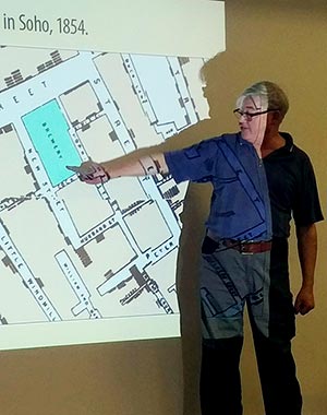
Conrad showed historically significant
examples of data visualisation: this is John Snow’s famous
map of deaths by cholera in Soho, 1854.
Photo David Dickinson.
The topic of the NetIKX seminar on 26 January 2017 was ‘Information Design – approaches to better communication’. Information Design (ID) is a collection of practices using visual design, clear writing and thinking about human factors, to make information easier to understand – especially information for the general public. Information designers work across a range of types of media, from road signs to government forms, user manuals to transport maps, bank statements to legal contracts, and increasingly with information presented through computer interfaces and Web sites.
I was the first speaker, running through a background history and the theoretical underpinnings of ID, and showing examples with a strong visual component. Ruth Miller then took over and focused on the Plain Language side of things. Both Ruth and I have been active around the Information Design Association in the UK (IDA) for 25+ years.
Here, I’m giving only a brief summary of my own presentation; as I had prepared it in written form with illustrations, I’ve thought it best to convert that into a kind of stand-alone essay; THIS is the link to it. Ruth’s contribution, however, is presented below at greater length, as it isn’t represented elsewhere.
Introducing Information Design
In my opening presentation I explained that the awkward label ‘Information Design’ emerged in the late 1970s as a rallying point for a diverse bunch of folk committed to clarity and simplicity in information presentation. That led to the founding of the Information Design Journal, a series of conferences, and organisations such as the IDA. Some people came into this from a graphic design background; some were committed to the simplification of written language. Psychologists, linguists and semioticians have also contributed their insights.
Despite this avowed interdisciplinarity, the ID community has sadly kept aloof from people in information and knowledge management. One of the exceptional people acting as a bridge is Liz Orna, long associated with NetIKX and its predecessor the Aslib IRM Network. In her writing, Liz has long emphasised the important role of ‘information products’ as artefacts designed for conveying knowledge.
Visual examples across the ages
I then conducted a whistle-stop history tour of innovation in making complicated stuff easier to understand through pictorial and typographic means, including:

Detail of a table of payments to temple officials, from Sumeria (2500 BCE)
- Tables, a surprisingly old way of handling information (reaching way back to Sumeria in about 2500 BCE). My table examples included tide-tables, ‘ready reckoners’, and text in tabular formats.
- Diagrams/drawings, ranging from more exactingly accurate ones such as anatomical atlases and sea-navigation charts, to line drawings and schematic diagrams which remove unnecessary detail so that they can focus on communicating (for example, how things work).
- Harry Beck’s London Underground diagram got a special mention, given its iconic status. It is often called a ‘map’ but in reality it is a service network diagram, and this approach to transport information has been copied worldwide.
- Charts and graphs including Joseph Priestley’s first timeline, William Playfair’s invention of the line and area chart, and Florence Nightingale’s ‘coxcomb diagrams’ for presenting statistics.
- Data maps, such as John Snow’s 1854 plot of cholera deaths around the Broad Street pump in Soho (see photo above).
- Network diagrams as used to represent links between entities or people, or to explain data flows in a software system.
I also mentioned business forms and questionnaires as an important genre, but I left further exploration of this topic to Ruth who has more experience with these.
Where did Information Design thinking come from?
The above examples, which I illustrated using pictures, show trends and innovations in the presentation of information. Next I looked at how the quest for clear communication became more self-aware as a professional activity, more bolstered with theory, and better organised into communities of practice.
This seems to have happened first with work on improving the clarity of writing (the content that is, not the typographic form). In the 1940s, Rudolf Flesch and Robert Gunning proposed some objective ways of measuring the readability of text, by calculations involving the length of sentences and the average number of syllables per word. In the UK, Sir Ernest Gowers formulated a guide to plain English writing to educate civil servants, culminating in the famous book The Complete Plain Words which is still in print after six decades and a number of revisions.
In the Second World War, the technical sophistication of weapons, plus the need to engage the public in civil defence preparedness seem to have been drivers for innovations in technical documentation and the creation of training and public information materials, and the job description ‘Technical Author’ came into being. As this trend in technical documentation continued in the post-War era, technical communicators organised themselves into associations like the STC and ISTC. In the richer industries such as aerospace, technical documentation also pioneered the use of early WYSIWYG computer systems like Xerox Docomenter and Interleaf for document composition.
In 1943, the UK Medical Research Council formed its Applied Psychology Unit in Cambridge, initially to investigate how to help armed forces personnel understand and cope with information and machine displays under stressful conditions. Post-war, APU researcher Pat Wright went on to investigate factors in text legibility and comprehension; and Don Norman contributed to the establishment of Cognitive Science as a discipline, and helped Apple Computer as its first User Experience Architect.
In 1978, NATO sponsored a conference in the Netherlands about human factors in the design of non-electronic information displays; the papers were published as ‘Information Design’ in 1984. The Information Design Journal was set up in the aftermath of the event and was then the focus for a number of conferences in the UK. As for the IDA, it was launched in 1991.
Some issues and developments
I rounded off my presentation by touching on three issues which have been woven in and out of Information Design practice down the years:
‘Desktop publishing’, such as the introduction of PageMaker, QuarkXPress and Ventura software for personal computers, put typesetting control and the design of paper and screen-based publications into the hands of graphic designers. This was a powerful enabler for information designers in particular.
Understanding the reader remains a challenge for anyone who truly seeks to communicate clearly. It’s dangerous to make assumptions about what will make sense to a user community unless you find out about that community. Today there is growing sophistication in using qualitative research methods and even ethnography to inform more effective writing and design.
Prototyping and usability testing – making prototypes is easier than before, using personal computer tools. Testing prototypes with a sample of people representative of the eventual users can provide very useful insights, as Ruth would later illustrate from her own experience.
I closed my section of the meeting by speculating that the realm of information and knowledge management has hitherto tended to be dominated by librarians and like professionals, people who focus on curating and organising collections of information resources. I would like there to be more engagement between this group and those actively engaged in designing and creating information products in the first place. Liz Orna has described such information products as having a central role in conveying knowledge between people.
I then handed the meeting over to Ruth.
Ruth Miller on plain language
Ruth explained that she did not train to be a plain language communicator; she fell into it, and found it a perfect match for her personality. Like many people who work on improving communication, she notices things that are odd or confusing in everyday life, and wonders how they could be organised better. She would describe herself as a Simplifier: someone who looks at information and thinks about how to make it easier for people to understand.
More recently, Ruth has had the experience of teaching English to unaccompanied minors, as a volunteer at a refugee camp in Greece.
Plain language is not new. ‘Let thy speech be short, comprehending much in few words,’ it says in Ecclesiasticus (Sirach) (32:8), which dates from about 200 BCE. From Ptolemaic Egypt, we have a letter from a Minister of Finance to a senior civil servant, saying ‘Apollonius to Zeno, greetings. You did right to send the chickpeas to Memphis. Farewell!’ These quotes are from a 1988 pamplet called ‘Making it Plain: a plea for plain English in the Civil Service’, with a foreword by Margaret Thatcher.
Thatcher promoted plain language writing. Early in her first government she engaged Derek Rayner, former CEO of Marks and Spencer, to commission a series of reports on efficiency in government, the ‘Rayner Reviews’. One of these, Forms into Shape (1981), analysed the use of forms in the Department of Health and Social Security (DHSS), and recommended the setting up of specialist Forms Units in government departments. Ruth would have more to say about forms design later, from her experience inside one of those units.
Ruth then showed an illustration from the horticulture manual Flora, Ceres and Pomona by John Rea, beside an excerpt in which Rea says that he ‘has not inserted any of those notorious lies I have frequently found in books of this subject, but in plain English terms, set down the truth in every particular’. This is the earliest use Ruth has found of the phrase ‘plain English’ – it dates from 1665.
When plain language explanation should be unnecessary!
In many circumstances you shouldn’t need an explanation. Ruth showed a photo of a bathroom tap with a square knob set some centimetres to the right of it, from a British hotel. She couldn’t figure out how to make water come out of it. Evidently she wasn’t alone in this: the hotel had added a sign saying ‘Tilt Taps to Operate’ – which only made matters more confusing (the tap does not tilt, and there is only one of it). ‘Turn knob to operate tap’ would have been better – but even then, it’s an example of information as a prosthesis; had the artefact been better designed in the first place, it would not be necessary to help it with an information crutch.
Ruth also showed a photo of a fine mahogany boardroom table she had encountered at a business meeting. It’s useful to have a table on which to place your bag, so you can unpack the things you need for the meeting. On this table was placed a sign, ‘Please Do Not Put Briefcases on Tables as It Damages the Surface’. Ignoring points of dubious grammar, and the strange capitalisation… isn’t it just daft to provide a table you can’t use as a table?
‘If you go away from this meeting with only one thought,’ said Ruth, ‘it should be: think about the whole situation and challenge the need to explain, however clearly, something that is nonsense in the first place.’
Siegel and Gale experience
After working in government service, Ruth moved to the communication consultancy Siegel and Gale. This was an exciting time when computer technology and laser printers were changing how personalised documents such as utility bills and bank statements could be delivered. Now less ‘computerish’ fonts could be used; layouts could be more sophisticated; type size and boldness could be used for emphasis.
Siegel and Gale caused a stir in the 1990s with their redesign of the British Telecom phone bill. This put summary information on the front page, and more detail on follow-on pages; it used simplified language, and logical grouping of items. As a result the number of customer billing enquiries fell by 25%. BT also found that customers paid bills more promptly.
Siegel and Gale once won the Design Effectiveness Awards with a humble Royal Mail redirection form. Before the redesign, that form had an 87% error rate when customers filled it in, costing Royal Mail about £10,000 a week. The redesigned form paid for itself in just 17 days!
Siegel and Gale also moved into the redesign of bank statements. For Barclays, they changed the technical language of ‘Debits’ and ‘Credits’ to ‘Money out’ and ‘Money in’. In other words, name things the way people think about them, in the language they are used to.
Conrad had mentioned ethnographic research in passing; Ruth refers to a useful aspect of this as ‘watching people use things’. Once she worked on a booklet for TalkTalk, to help people set up an Internet router at home. When it was launched, they then embarked on research to see how effective the booklet design had been. What had really helped was the inclusion of photos: this is what’s in the box, this is what it will look like when you have set it up, and so on.
This project did have its moments of comedy. There was a particular router which doubled as a picture frame: you could slip a photo into a slot on the front of it to ‘domesticate’ the thing. Ruth overheard someone telling a friend that she had just about set her router up, and had managed pretty well – but she wasn’t quite finished because now she had to find a suitable photo! (Perhaps they should have added the word ‘optional’?)
Plain language: campaigns for awareness
The case for plain language use was championed within the public sector in Britain, Australia and Canada. In the USA, the lead was taken more by private business. In the US financial sector, companies wanted people to understand things like investing. From the regulatory side, the US Securities and Exchange Commission pressed for consumer agreements to be written in language that people signing up to them would understand.
In the UK, the Plain English Campaign deserves credit for raising awareness and getting the bandwagon rolling. They were and still are a force for good. They were also very clever at marketing. Doesn’t ‘Plain English Campaign’ sounds like a publicly-funded body, or an NGO? In fact, they are a commercial business.
The ‘Crystal Mark’, which the PEC invented, was a brilliant idea and a money-spinner too. Many companies believed that getting a Crystal Mark on one of their documents was a mark of quality, like a kite mark. If you saw a Crystal Mark, the implication was, no-one should have a problem understanding that document. But that isn’t necessarily true, partly because PEC is financially motivated to award Crystal Marks, but also because their focus is far too narrowly set on language construction. An over-long and complicated set of Terms and Conditions, set in small and hard-to-read type, could still get a Crystal Mark from the PEC – if they deemed the language to be ‘plain’.
Ruth’s more recent experience
More recently, Ruth has worked freelance, and she showed some examples of projects which have brought her pleasure. She has enjoyed working with Standard Life, simplifying their policy documents, and materials about investments and pensions. What got Standard Life walking along the road to simplification was a letter from a customer who complained:
My degree is only in mechanical enginering. I can understand differential calculus, I can design all the machinery for a sewage treatment works, I can design you a bridge but I cannot understand what my policy is worth.
In the redesigns, they introduced summaries, and contextual notes, and made use of two-colour print. She added: these may be humble documents; but when you do them well, it can actually get noticed, and besides, it improves the quality of people’s lives.
Form and function: lessons from the DHSS experience
Ruth has long enjoyed doing battle with forms. When she was a civil servant, the language used in forms was from the 1950s, and they were very difficult to fill in; no wonder that the launch of the Campaign for Plain English was marked with shredding forms in Trafalgar Square!
Ruth once worked in a forms design unit in a government department (the DHSS); this team had a brief to radically improve such forms. The team included writers and designers, and had a decent budget for research and testing too. They had input from Pat Wright, the applied psychologist Conrad had mentioned, and the Adult Literacy Basic Skills Unit; RNIB providing input about impaired vision. They investigated what trips people up when they try to fill out a form – type size, vocabulary, question sequence, whatever.
The unit was supposed to redesign 150 forms and in the first two years they managed about eight! However, that seemingly slow progress was because the research and testing and analysis was very ‘front loaded’ (it paid dividends later).
- With forms, there is sometimes a trade-off between length and complexity. Some forms in her collection are booklets of 28 or even 36 pages! People appear to prefer a long but easy to understand form. Reorganising questions so all you have to do is tick a box is helpful – but it takes space. Clear signposting to take you to the next relevant part of the form is good – and also takes space!
- Many forms have an introductory paragraph which tell people how to fill in the form (write clearly, write in block capitals, use a black pen…). However, research shows that hardly anyone reads that bit. In any case, people’s behaviour is not changed by such prompts, so why bother?
- If you want to provide guidance as to how to fill out specific parts of a form, provide it the ‘point of use’ – embed your explanations, and any necessary definitions, right in the questions themselves. An example might be the question: ‘Do you have a partner?’ Then you can clarify with something like ‘By partner we mean someone you are married to, or live with as if you were married to them’.
- It’s useful to establish what graphic designers call the grid – a set of rules about how space is to be used on the page to lay out the form. For example, the questions and explanations might be placed in a leftmost column, while the space for answers might span the next two columns. She showed some examples of gridless and chaotic forms, later redesigned according to a grid.
Once upon a time, forms would be made up only of type, plus solid or dotted lines (for example, in letterpress printing of the early 20th century). That has created a set of norms which we don’t have to feel bound to these days. Today, lithographic printing permits the use of tints (printing a light shade of a colour by using a pattern of dots that are too small to be individually distinguished). Tints can help to distinguish which parts of the form are for writing into (with a white plain background) from those parts which ask the questions and provide help (where type is set on a tinted background). A second print colour, if affordable, can also be helpful.
Testing also found that it was very helpful to re-jig questions so they could be answered with tick-boxes. Boxes which are used to determine a ‘yes/no’ condition should follow a ‘yes’ kind of question, as in ‘Tick this box if you are married’.
Some such yes/no questions, if answered in the affirmative, will lead to others. Perhaps controversially, Ruth’s team in the DHSS reversed the usual order so that the ‘No’ tick box came before the ‘Yes’ one: this helped them to lay out the subsidiary questions more clearly. (In an online form, of course, such subsidiary questions can be made to disappear automagically if the answer is ‘No’.)
Ruth mentioned ‘hairy boxes’ – those pesky ones with vertical separators that are intended to guide you to place one letter in each demarcated space. They’ve proved to be a complete disaster. Someone mentioned the US Immigration form for filling out before the plane lands, which has this feature.
That’s not the only problem with that US Immigration form, remarked Ruth. It’s very bad at conveying the relationship between question and response space: people often assume that the space for the answer is the one below the question. Only when they come to the last question do they find that the questions are set below the spaces for answering them.
Signposting is important in complex forms, helping people to skip questions that don’t apply to them (‘If you answered ‘No’ here, go forward to Section C’).
For the benefits claim forms, the DHSS team realised that many claimants don’t have the fine motor skills to write small, so they made more space for the answers – and left a substantially larger space for the signature.
Many forms end at that point, but the DHSS team added a section to tell the form-filler what to do now, what supporting documents to attach, and what would happen subsequently. It helped manage expectations and gave people a sense of the timescale according to which DHSS would respond.
Quick exercise
Ruth got us to work in pairs on an exercise based on the competition which the Plain Exglish Campaign used to set in the pages of the Daily Express. She had multiple copies of three or four real life examples of gobbledygook and invited us to simplify the messages; we wrote our alternatives on the small A4 white-boards which she uses in teaching, called ‘show-me’ boards in the trade, so we could hold them up to compare alternatives acros the room.
One of the original offerings read: ‘We would advise that attached herewith is the entry form, which has been duly completed, and would further advise that we should be grateful if you would give consideration to the various different documents to which we have made reference.’
One suggested rewording was ‘Please note the documents referred to in this form’; another was ‘Here is the entry form; please note the referenced documents.’ PEC’s original winner was ‘Attached is the completed entry form. Please consider the documents referred to’ – though she personally preferred that ‘Here is’ version. We went through another couple of examples too.
Problem areas which people noted include:
- use of the subjunctive mood in verbs
- use of the passive tense in verbs
- long sentences with multiple clauses
- In the wording of contracts, it may be unclear who is meant by ‘we’ and ‘you’ in something the customer is supposed to sign. Jane Teather said that the company had commissioned the form, they should be ‘we’ and the customer ‘you’.
Something else that occupied us for a few minutes was the changing norms around the use of ‘shall’ versus ‘will’.
Four Cs
Ruth offered four Cs as ideals — Clear, Consistent, Concise and Compelling.
The ‘consistency’ ideal suggests that if you set up a convention in the communication – such as who is ‘we’ and who is ‘you’ in a text, and what something is to be called – you should stick to it. This is defiance of a literary concept of ‘elegant variation’, the idea whereby you ransack the thesaurus in a hunt for synonyms, rather than re-use the original term; that may make for a fine essay, but for these purposes, bin it. Once you have called a spade a spade, stick to it.
In written communications with a broad public, subsidiary clauses and relative clauses are probably confusing and best broken out into separate sentences, said Ruth. Likewise she pronounced a fatwa against parenthesis: anything in brackets or between en dashes. They are not bad English by any means, but you risk confusing the wider audience. In any case, stuff in parenthesis is at risk of being thought as of lesser importance (though you might move ‘bracketed bits’ to the end, she said, which is what I am doing now).
A question was raised, in response to a redesign Ruth showed of transforming a bullet list into a tabular layout, about the implications of using tabular data online for accessibility for blind computer users. My own feeling, confirmed after discussion with others, is that an HTML table will ‘linearise’ nicely when reduced to readable text e.g. for voice synthesis presentation: first the header row will be read, then the first body row, then the next, and so on. However, this isn’t good enough. A table is an inherently visual device which allows the reader pay selective attention to rows and columns. Really, the information should be completely re-organised to make an audio presentation meaningful to a vision-impaired person. (Think about how you would present the information on radio!)
Ruth’s overall approach to making textual information more accessible includes these tips:
- Look to patterns in the text which can be exploited, for example by reorganising material into bullet lists. If Ruth sees a series of clauses linked by ‘and’, she considers bullet points as an alternative.
- If a list of bullet points gets excessively long, analyse to see if it can be broken into two shorter lists.
- Break up large slabs of text; Ruth avoids paragraphs which are more than three or four lines long.
Four mantras
Here are four other thoughts which Ruth offered in the course of the afternoon:
- ‘Nonsense in plain language is still nonsense!’ – as someone in Standard Life had remarked.
- Rob Eagleton, an Australian practitioner in plain English: ‘It’s the writer’s responsibility to be clear, not the reader’s responsibility to understand.’
- ‘Clear writing stems from clear thinking.’
- ‘Simplicity isn’t simple to do.’ Communicating well is an art, a craft, a skill, and it is not that simple to do well. Because writing is something everybody does daily, it’s tempting to think that everone can do it well. Testing reveals this is not true! There is scope here for learning and for training.
Reactions
We would be interested to hear people’s reactions to this topic. Meanwhile here are some thoughts posted by NetIKX committee member Clare Parry:
Given the constraints of a half-day seminar, we inevitably only scratched the surface of this vast topic. Several participants commented afterwards that they would have liked to discuss design issues specific to online forms – maybe a topic for a future seminar?
I also wondered how we could take the discussion forward to apply information design principles to the Internet of Things, the need for documentation to be readable by both humans and machines, the 'mobile-first' philosophy and the move towards embedding user manuals in products.
As these are all areas where there is a clear need for interdisciplinary collaboration, it was encouraging to see participants from both information management and technical communications backgrounds contributing to the seminar and acknowledging our common aims. In an era of 'alternative facts' and 'fake news', clear and accurate communication is more important than ever.