
Making true connections in a complex world
Graph database technology
and Linked Open Data
(NetIKX meeting, 25 January 2018)
The first NetIKX meeting of 2018 looked at new technologies and approaches to managing data and information, escaping the limitations of flat-file and relational databases. Dion Lindsay introduced the concepts behind ‘graph databases’, and David Clarke illustrated the benefits of the Linked Data approach with case studies, where the power of a graph database had been enhanced by linking to publicly available resources. The two presentations were followed by a lively discussion, which I also report here.

Dion Lindsay
The New Graph Technology of Information
Dion Lindsay is an independent consultant well known to NetIKX members. He offered us a simple introduction to graph database technology, though he avers he is no expert in the subject. He’d been feeling unclear about the differences between managing data and information, and thought one way to explore that could be to study a ‘fashionable’ topic with a bit of depth to it. He finds graph database technology exciting, and thinks data- and information-managers should be excited about it too!
Flat-file and relational database models
In the last 40 years, the management of data with computers has been dominated by the Relational Database model devised in 1970 by Edgar F Codd, an IBM employee at their San Jose research centre.
FLAT FILE DATABASES. Until then (and also for some time after), the model for storing data in a computer system was the ‘Flat File Database’ — analogous to a spreadsheet with many rows and columns. Dion presented a made-up example in which each record was a row, with the attributes or values being stored in fields, which were separated by a delimiter character (he used the | sign, which is #124 in most text encoding systems such as ASCII).
Example: Lname, Fname, Age, Salary|Smith, John, 35, £280|
Doe, Jane 28, £325|Lindsay, Dion, 58, £350…
In older flat-file systems, each individual record was typically input via a manually-prepared 80-column punched card, and the ingested data was ‘tabulated’ (made into a table); but there were no explicit relationships between the separate records. The data would then be stored on magnetic tape drives, and searching through those for a specific record was a slow process.
To search such a database with any degree of speed required loading the whole assembled table into RAM, then scanning sequentially for records which matched the terms of the query; but in those early days the limited size of RAM memory meant that doing anything clever with really large databases was not possible. They were, however, effective for sequential data processing applications, such as payroll, or issuing utility bills.
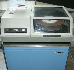
The IBM 2311 (debut 1964) was
an early hard drive unit with 7.25 MB storage.
(Photo from Wikimedia Commons user
‘I, Deep Silence’
[Details])
HARD DISKS and RELATIONAL DATABASES. Implementing Codd’s relational database management model (RDBM) was made possible due to a fast-access technology for indexed file storage, the hard disk drive, which we might call ‘pseudo-RAM’. Hard drives had been around since the late fifties (the first was a component of the IBM RAMAC mainframe, storing 3.75 MB on nearly a ton of hardware), but it always takes time for the paradigm to shift…
By 1970, mainframe computers were routinely being equipped with hard disk packs of around 100 MB (example: IBM 3330). In 1979 Oracle beat IBM to market with the first Relational Database Management System (RDBMS). Oracle still has nearly half the global market share, with competition from IBM’s DB2, Microsoft SQL Server, and a variety of open source products such as MySQL and PostgreSQL.
As Dion pointed out, now it was possible to access, retrieve and process records from a huge enterprise-level database without having to read the whole thing into RAM or even know where it was stored on the disk; the RDBMS software and the look-up tables did the job of grabbing the relevant entities from all of the tables in the system.
TABLES, ATTRIBUTES, KEYS: In Codd’s relational model, which all these RDBMS applications follow, data is stored in multiple tables, each representing a list of instances of an ‘entity type’. For example, ‘customer’ is an entity type and ‘Jane Smith’ is an instance of that; ‘product’ is an entity type and ‘litre bottle of semi-skimmed milk’ is an instance of that. In a table of customer-entities, each row will represents a different customer, and columns may associate that customer with attributes such as her address or loyalty-card number.
One of the attribute columns is used as the Primary Key to quickly access that row of the table; in a classroom, the child’s name could be used as a ‘natural’ primary key, but most often a unique and never re-used or altered artificial numerical ID code is generated (which gets around the problem of having two Jane Smiths).
Possible/permitted relationships can then be stated between all the different entity types; a list of ‘Transactions’ brings a ‘Customer’ into relationship with a particular ‘Product’, which has an ‘EAN’ code retrieved at the point of sale by scanning the barcode, and this retrieves the ‘Price’. The RDBMS can create temporary and supplementary tables to mediate these relationships efficiently.
Limitations of RDBMs, benefits of graphs
However, there are some kinds of data which RDBMSs are not good at representing, said Dion. And many of these are the sorts of thing that currently interest those who want to make good use of the ‘big data’ in their organisations. Dion noted:
- situations in which changes in one piece of data mean that another piece of data has changed as well;
- representation of activities and flows.
Suppose, said Dion, we take the example of money transfers between companies. Company A transfers a sum of money to Company B on a particular date; Company B later transfers parts of that money to other companies on a variety of dates. And later, Company A may transfer monies to all these entities, and some of them may later transfer funds in the other direction… (or to somewhere in the British Virgin Islands?)
Graph databases represent these dynamics with circles for entities and lines between them, to represent connections between the entities. Sometimes the lines are drawn with arrows to indicate directionality, sometimes there is none. (This use of the word ‘graph’ is not be confused with the diagrams we drew at school with x and y axes, e.g. to represent value changes over time.)
This money-transfer example goes some way towards describing why companies have been prepared to spend money on graph data technologies since about 2006 — it’s about money laundering, and compliance with (or evasion of?) regulation. And its easier to represent and explore such transfers and flows in graph technology.
Dion had recently watched a YouTube video in which an expert on such situations said that it is technically possible to represent such relationships within an RDBMS, but it is cumbersome.
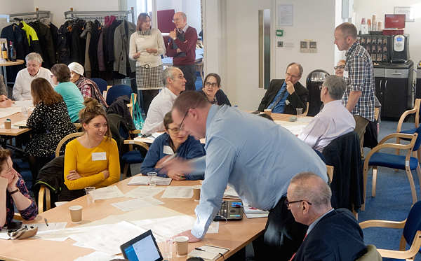
Most NetIKX meetings incorporate one or two table-group sessions to help people make sense of what they have learned. Here, people are drawing graph data diagrams to Dion Lindsay’s suggestions.
Exercise
To get people used to thinking along graph database lines, Dion distributed a sheet of flip chart paper to each table, and big pens were found, and he asked each table group to start by drawing one circle for each person around the table, and label them.
The next part of the exercise was to create a circle for NetIKX, to which we all have a relationship (as a paid-up member or paying visitor), and also circles representing entities to which only some have a relation (such as employers, or other organisations). People should then draw lines to link their own circle-entity to these others.
Dion’s previous examples had been about money-flows, and now he was asking us to draw lines to represent money-flows (i.e. if you paid to be here yourself, draw a line from you to NetIKX; but if your organisation paid, that line should go from your organisation-entity to NetIKX). I noted that aspect of the exercise engendered some confusion about the breadth of meaning that lines can carry in such a graph diagram. In fact they can represent any kind of relationship, so long as you have defined it that way, as Dion later clarified.
Dion had further possible tasks up his sleeve for us, but as time was short he drew out some interim conclusions. In graph databases, he summarised, you have connections instead of tables. These systems can manage many more complexities of relationships that either a RDBMS could cope with, or that we could cope with cognitively (and you can keep on adding complexity!) The graph database system can then show you what comes out of those complexities of relationship, which you had not been able to intuit for yourself, and this makes it a valuable discovery tool.
HOMEWORK: Dion suggested that as ‘homework’ we should take a look at an online tool and downloadable app which BP have produced to explore statistics of world energy use. The back end of this tool, Dion said, is based on a graph database.
https://www.bp.com/en/global/corporate/energy-economics/energy-charting-tool.html
Building Rich Search and Discovery:
User Experiences with Linked Open Data

Dave Clarke of Synaptica
DAVE CLARKE is the co-founder, with Trish Yancey, of Synaptica LLC, which since 1995 has developed enterprise-level software for building and maintaining many different types of knowledge organisation systems. Dave announced that he would talk about Linked Data applications, with some very practical illustrations of what can be done with this approach.
The first thing to say is that Linked Data is based on an ‘RDF Graph’ — that is, a tightly-defined data structure, following norms set out in the Resource Description Framework standards (RDF) described by the World Wide Web Consortium (W3C).
In RDF, statements are made about resources, in expressions which take the form subject – predicate – object. For example: ‘daffodil’ – ‘has the colour’ – ‘yellow’. (Also, ‘daffodil’ – ‘is a member of’ – ‘genus Narcissus’; and ‘Narcissus pseudonarcissus’ – ‘is a type of’ – ‘daffodil’.)
Such three-part statements are called ‘RDF triples’ and so the kind of database which manages them is often called an ‘RDF triple store’. The triples can also be represented graphically, in the manner that Dion had introduced us to, and can build up into a rich mass of entities and concepts linked up to each other.
Describing Linked Data and Linked Open Data
Dion had got us to do an exercise at our tables, but each table’s graph didn’t communicate with any other’s, like separate fortresses. This is the old database model, in which systems are designed not to share data. There are exceptions of course, such as when a pathology lab sends your blood test results to your GP, but those acts of sharing follow strict protocols.
Linked Data, and the resolve to be Open, are tearing down those walls. Each entity, as represented by the circles on our graphs, now gets its own ‘HTTP URI’, that is, its own unique Universal Resource Identifier, expressed with the methods of the Web’s Hypertext Transfer Protocol — in effect, it gets a ‘Web address’ and becomes discoverable on the Internet, which in turn means that connections between entities are both possible, and technically fairly easy and fast to implement.
And there are readily accessible collections of these URIs. Examples include:
- MeSH, the Medical Subject Headings taxonomy of medical concepts
(see ‘Internal medicine’ as an example, at http://id.nlm.nih.gov/mesh/D007388) - Getty Art & Architecture Thesaurus
(example concept ‘Renaissance’ at http://vocab.getty.edu/at/300021140) - (US) Library of Congress Name Authority
(example, ‘Barack Obama’ at http://id.locx.gov/authorities/names/n94112934) - Geonames, a global gazetteer of place names
(example ‘London UK’ at http://www.geonames.org/2643743) - The European Environment Agency concept taxonomy of habitats,
for example ‘inland surface waters’ at http://eunis/eea.europa.eu/habitats/58) - WordNet Lexical Database,
for example ‘finance’ at http://wordnet-rdf.princeton.edu/wn32/101136358-n)
We are all familiar with clickable hyperlinks on Web pages – those links are what weaves the ‘classic’ Web. However, they are simple pointers from one page to another; they are one-way, and they carry no meaning other than ‘take me there!’
In contrast, Linked Data links are semantic (expressive of meaning) and they express directionality too. As noted above, the links are known in RDF-speak as ‘predicates’, and they assert factual statements about why and how two entities are related. Furthermore, the links themselves have ‘thinginess’ – they are entities too, and those are also given their own URIs, and are thus also discoverable.
People often confuse Open Data and Linked Data, but they are not the same thing. Data can be described as being Open if it is available to everyone via the Web, and has been published under a liberal open licence that allows people to re-use it. For example, if you are trying to write an article about wind power in the UK, there is text and there are tables about that on Wikipedia, and the publishing license allows you to re-use those facts.
Stairway through the stars
Tim Berners-Lee, who invented the Web, more recently has become an advocate of the Semantic Web, writing about the idea in detail in 2005, and has argued for how it can be implemented through Linked Data. He proposes a ‘5-star’ deployment scheme for Open Data, with Linked Open Data being the starriest and best of all. Dave in his slide-set showed a graphic shaped like a five-step staircase, often used to explain this five-star system:
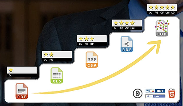
The ‘five-step staircase’ diagram often used to explain the hierarchy of Open Data types.
- One star: this is when you publish your data to the Web under open license conditions, in whatever format (hopefully one like PDF or HTML for which there is free of charge reading software). It’s publishable with minimal effort, and the reader can look at it, print it, download and store it, and share it with others. Example: a data table which has been published as PDF.
- Two stars: this is where the data is structured and published in a format that the reader can process with software that accesses and works with those structures. The example given was a Microsoft Excel spreadsheet. If you have Excel you can perform calculations on the data and export it to other structured formats. Other two-star examples could be distributing a presentation slide set as Powerpoint, or a document as Word (though when it comes to presentational forms, there are font and other dependencies which can trip us up).
- Three stars: this is where the structure of a data document has been preserved, but in a non-proprietary format. The example given was of an Excel spreadsheet exported as a CSV file (comma-separated values format, a text file where certain characters are given the role of indicating field boundaries). (Perhaps the edges of this category have been abraded by software suites such as OpenOffice and LibreOffice which themselves use non-proprietary formats, and can open Microsoft-format files.)
- Four stars: this is perhaps the most difficult step to explain, and is when you put the data online in a graph database format, using open standards such as Resource Description Framework (RDF), as described above. For the publisher, this is no longer such a simple process and requires thinking about structures, and new conversion and authoring processes. The advantage to the users is that the links between the entities can now be explored as a kind of extended web of facts, with semantic relationships constructed between them.
- Five stars: this is when Linked Data graph databases, structured to RDF standards, ‘open up’ beyond the enterprise, and establish semantic links to other such open databases, of which there are increasingly many. This is Linked Open Data! (Note that a Linked Data collection held by an enterprise could be part-open and part-closed. There are often good commercial and security reasons for not going fully open.)
This hierarchy is explained in greater detail at http://5stardata.info/en/
Dave suggested that if we want to understand how many organisations currently participate in the ‘Linked Open Data Cloud’, and how they are linked, we might visit http://lod-cloud.net, where there is an interactive and zoomable SVG graphic version showing several hundred linked databases. The circles which represent them are grouped and coloured to indicate their themes, and if you hover your cursor over one circle, you will see an information box, and be able to identify the incoming and outgoing links as they flash into view. (Try it!)
The largest and most densely interlinked ‘galaxy’ in the LOD Cloud is in the Life Sciences; other substantial ones are in publishing and librarianship, linguistics, and government. One of the most central and most widely linked is DBpedia, which extracts structured data created in the process of authoring and maintaining Wikipedia articles (e.g. the structured data in the ‘infoboxes’). DBpedia is big: it stores nine and a half billion RDF triples!
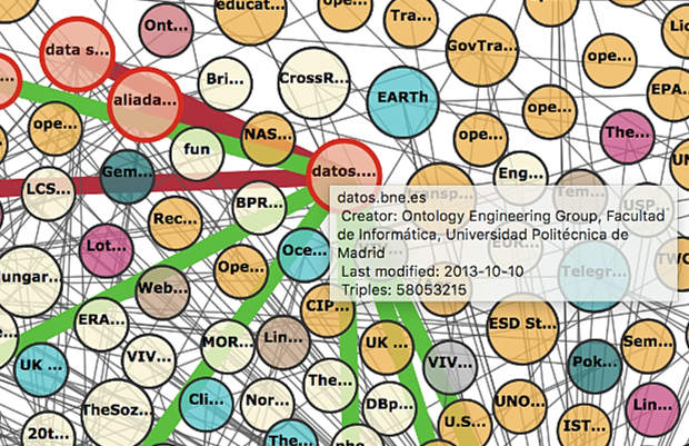
Screen shot taken while zooming into the heart of the Linked Open Data Cloud (interactive version). I have positioned the cursor over ‘datos.bne.es’ for this demonstration. This brings up an information box, and lines which show links to other LOD sites: red links are ‘incoming’ and green links are ‘outgoing’.
Use case: People in the News
The first case study Dave presented was an experiment conducted by his company Synaptica to enhance discovery of people in the news, and stories about them. A ready-made LOD resource they were able to use was DBpedia’s named graph of people. (Note: the Named Graphs data model is a variant on the RDF data model,: it allows RDF triples to talk about RDF graphs. This creates a level of metadata which assists searches within a graph database using the SPARQL query language).
Many search and retrieval solutions focus on indexing a collection of data and documents within an enterprise – ‘in a box’ if you like – and providing tools to rummage through that index and deliver documents which may meet the user’s needs. But what if we could also search outside the box, connecting the information inside the enterprise with sources of external knowledge?
The second goal of this Synaptica project was about what it could deliver for the user: they wanted search to answer questions, not just return a bunch of relevant electronic documents. Now, if you are setting out to answer a question, the search system has to be able to understand the question…
For the experiment, which preceded the 2016 US presidential elections, they used a reference database of about a million news articles, a subset of a much larger database made available to researchers by Signal Media (https://signalmedia.co). Associated Press loaned Synaptica their taxonomy collection, which covers more than 200,000 concepts covering names, geospatial entities, news topics etc. – a typical and rather good taxonomy scheme.
The Linked Data part was this: Synaptica linked entities in the Associated Press taxonomy out to DBpedia. If a person is famous, DBpedia will have hundreds of data points about that person. Synaptica could then build on that connection to external data.
SHOWING HOW IT WORKS. Dave went online to show a search system built with the news article database, the AP taxonomy, and a link out to the LOD cloud, specifically DBpedia’s ‘persons’ named graph. In the search box he typed ‘Obama meets Russian President’. The results displayed noted the possibility that Barack or Michelle might match ‘Obama’, but unhesitatingly identified the Russian President as ‘Vladimir Putin’ – not from a fact in the AP resource, but by checking with DBpedia.
As a second demo, he launched a query for ‘US tennis players’, then added some selection criteria (‘born in Michigan’). That is a set which includes news stories about Serena Williams, even though the news articles about Serena don’t mention Michigan or her birth-place. Again, the link was made from the LOD external resource. And he then narrowed the field by adding the criterion ‘after 1980’, and Serena stood alone.
It may be, noted Dave, that a knowledgeable person searching a knowledgebase, be it on the Web or not, will bring to the task much personal knowledge that they have and that others don’t. What’s exciting here is using a machine connected to the world’s published knowledge to do the same kind of connecting and filtering as a knowledgeable person can do – and across a broad range of fields of knowledge.
NATURAL LANGUAGE UNDERSTANDING. How does this actually work behind the scenes? Dave again focused on the search expressed in text as ‘US tennis players born in Michigan after 1980’. The first stage is to use Natural Language Understanding (NLU), a relative of Natural Language Processing, and long considered as one of the harder problem areas in Artificial Intelligence.
The Synaptica project uses NLU methods to parse extended phrases like this, and break them down into parts of speech and concept clusters (‘tennis players’, ‘after 1980’). Some of the semantics are conceptually inferred: in ‘US tennis players’, ‘US’ is inferred contextually to indicate nationality.
On the basis of these machine understandings, the system can then launch specific sub-queries into the graph database, and the LOD databases out there, before combining them to derive a result. For example, the ontology of DBpedia has specific parameters for birth date, birthplace, death date, place of death… these enhanced definitions can bring back the lists of qualifying entities, and via the AP taxonomy, find them in the news content database.
Use case: understanding symbolism inside art images
Dave’s second case study concerned helping art history students make searches inside images with the aid of a Linked Open Data resource, the Getty Art and Architecture Thesaurus.
A seminal work in Art History is Erwin Panofsky’s Studies in Iconology (1939), and Dave had re-read it in preparation for building this application, which is built on Panofskyan methods. Panofsky describes three levels of analysis of iconographic art images:
- Natural analysis gives a description of the visual evidence. It operates at the level of methods of representation, and its product is an annotation of the image (as a whole, and its parts).
- Conventional analysis (Dave prefers the term ‘conceptual analysis’) interprets the conventional meanings of visual components: the symbolism, allusions and ideas that lie behind them. This can result in semantic indexing of the image and its parts.
- Intrinsic analysis explores the wider cultural and historical context. This can result in the production of ‘knowledge graphs’
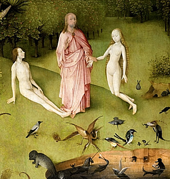
Detail from the left panel of Hieronymous Bosch’s painting ‘The Garden of Earthly Delights’, which is riddled with symbolic iconography.
THE ‘LINKED CANVAS’ APPLICATION. The educational application which Synaptica built is called Linked Canvas (see http://www.linkedcanvas.org/). Their first step was to ingest the art images at high resolution. The second step was to ingest linked data ontologies such as DBpedia, Europeana, Wikidata, Getty AAT, Library of Congress Subject Headings and so on.
The software system then allows users to delineate Points of Interest (POIs), and annotate them at the natural level; the next step is the semantic indexing, which draws on the knowledge of experts, and controlled vocabularies. Finally users get to benefit from tools for search and exploration of the annotated images.
With time running tight, Dave skipped straight to some live demos of examples, starting with the fiendishly complex 15th century triptych painting The Garden of Earthly Delights. At Panofsky’s level of ‘natural analysis’, we can decompose the triptych space into the left, centre and right panels. Within each panel, we can identify ‘scenes’, and analyse further into details, in a hierarchical spatial array, almost the equivalent of a detailed table of contents for a book. For example, near the bottom of the left panel there is a scene in which God introduces Eve to Adam. And within that we can identify other spatial frames and describe what they look like (for example, God’s right-hand gesture of blessing).
To explain semantic indexing, Dave selected an image painted 40 years after the Bosch — Hans Holbein the Younger’s The Ambassadors, which is in the National Gallery in London. This too is full of symbolism, much of it carried by the various objects which litter the scene, such as a lute with a broken string, a hymnal in a translation by Martin Luther, a globe, etc. To this day, the meanings carried in the painting are hotly debated amongst scholars.
If you zoom in and browse around this image in Linked Canvas, and as you traverse the various artefacts which have been identified, the word-cloud on the left of the display changes contextually, and what this reveals in how the symbolic and contextual meanings of those objects and visual details have been identified in the semantic annotations.
An odd feature of this painting is the prominent inclusion in the lower foreground of an anamorphically rendered (highly distorted) skull. (It has been suggested that the painting was designed to be hung on the wall of a staircase, so that someone climbing the stairs would see the skull first of all.) The skull is a symbolic device, a reminder of death or memento mori, a common visual trope of the time. That concept of memento mori is an element within the Getty AAT thesaurus, and the concept has its own URI, which makes it connectable to the outside world.
Dave then turned to Titian’s allegorical painting Bacchus and Ariadne, also from the same period, and also from the National Gallery collection, and based on a story from Ovid’s Metamorphoses. In this story, Ariadne, who had helped Theseus find his way in and out of the labyrinth where he slew the Minotaur, and who had become his lover, has been abandoned by Theseus on the island of Naxos (and in the background if you look carefully, you can see his ship sneakily making off). And then along comes the God of Wine, Bacchus, at the head of a procession of revellers, and falling in love with her at first glance, he leaps from the chariot to rescue and defend her.
Following the semantic links (via the LOD database on Iconography) can take us to other images about the tale of Ariadne on Naxos, such as a fresco from Pompeii, that shows Theseus ascending the gang-plank of his ship while Ariadne sleeps. As Dave remarked, we generate knowledge when we connect different data sets.
Another layer which they built on top of the Linked Canvas application, was the ability to create ‘guided tours’ that walk the viewer around an image, with audio commentary. The example he played for us was a commentary on the art within a classical Greek drinking-bowl, explaining the conventions of the symposium (Greek drinking party). Indeed, an image can host multiple such audio commentaries, letting a visitor experience multiple interpretations.
In building this image resource, Synaptica made use of a relatively recent standard called the International Image Interoperability Framework (IIIF). This is a set of standardised application programming interfaces (APIs) for Web sites that aim to do clever things with images, and collections of images. For example, it can be used to load images at appropriate resolutions and croppings, which is useful if you want to start with a fast-loading overview image and then zoom in. The IIIF Search API is used for searching the annotation content of images.
Searching within Linked Canvas is what Dave described as ‘Level Three Panofsky’. You might search on an abstract concept such as ‘love’, and be presented with a range of details within a range of images, plus links to scholarly articles linked to those.
Post-Truth Forum
As a final example, Dave showed us http://www.posttruthforum.org which is an ontology of concepts around the ideas of ‘fake news’ and the ‘post-truth’ phenomenon, with thematically organised links out to resources on the Web, in books and journals. Built by Dave using Synaptica Graphite software, it is Dave’s private project born out of a concern about what information professionals can do as a community to stem the appalling degradation of the quality of information in the news media and social media.
For NetIKX members (and for readers of this post), going to Dave’s Post Truth Forum site is also an opportunity to experience a public Linked Open Data application. People may also want to explore Dave’s thoughts as set out on his blog, www.davidclarke.blog.
Taxonomies vs Graphs
In closing, Dave wanted to show a few example that might feed our traditional post-refreshment round-table discussions. How can we characterise the difference between a taxonomy and a data graph (or ontology)? His first image was an organisation chart, literally a regimented and hierarchical taxonomy (the US Department of Defense and armed forces).
His second image was the ‘tree of life’ diagram, the phylogenetic tree which illustrates how life forms are related to each other, and to common ancestor species. This is also a taxonomy, but with a twist. Here, every intermediate node in the tree inherits characteristics from higher up, but adds new ones. So, mammals have shared characteristics (including suckling young), placental mammals add a few more, and canids such as wolves, jackals and dogs have other extra shared characteristics. (This can get confusing if you rely too much on appearances: hyenas look dog-like, but are actually more closely related to the big cats.)
So the Tree of Life captures systematic differentiation, which a taxonomy typically cannot. However, said Dave, an ontology can. In making an ontology we specify all the classes we need, and can specify the property sets as we go. And, referring back to Dion’s presentation, Dave remarked that ontologies do not work easily in a relational database structure; but they work really well in a graph database. In a graph database you can handle processes as well as things, and specify the characteristics of both processes and things.
His third and final image was of the latest version of the London Underground route diagram. This is a graph, specifically a network diagram, that is characterised not by hierarchy, but by connections. Could this be described in a taxonomy? You’d have to get rid of the Circle line, because taxonomies can’t end up where they started from. With a graph, as with the Underground, you can enter from any direction, and there are all sorts of ways to make connections.
We shouldn’t think of ditching taxonomies; they are excellent for some information management jobs. Ontologies are superior in some applications, but not all. The ideal is to get them working together. It would be a good thought-experiment for the table groups to think about what, in our lives and jobs, are better suited to taxonomic approaches, and what would be better served by graphs and ontologies. And, we should think about the vast amounts of data out there in the public domain, and whether our enterprises might benefit from harnessing those resources.
Discussion
Following NetIKX tradition, after a break for refreshments, people again settled down into small table groups. We asked participants to discuss what they had heard and identify either issues they thought worth raising, or thinks that they would like to know more about.
I was chairing the session, and I pointed out that even if we didn’t have time in subsequent discussion to feed everyone’s curiosity, I would do my best to research supplementary information to add to this account which you are reading.
I ran the audio recorder during the plenary discussion, so even though I was not party to what the table groups had discussed internally, I can report with some accuracy what came out of the session. Because the contributions jumped about a bit from topic to topic, I have resequenced them to make them easier for the reader to follow.
AI vs Linked Data and ontologies?
Steve Dale wondered if these efforts to compile graph databases and ontologies was worth it, as he believed Artificial Intelligence is reaching the point where a computer can be thrown all sorts of data – structured and unstructured – and left to figure it out for itself through machine learning algorithms. Later, Stuart Ward expressed a similar opinion. Speaking as a business person, not a software wizard, he wonders if there is anything that he needs to design?
Conrad, in fielding this question, mentioned that on the table he’d been on (Dave Clarke also), they had looked some more into the use in Dave’s examples of Natural Language Understanding; that is a kind of AI component. But they had also discussed the example of the Hieronymous Bosch painting. Dave himself undertook the background research for this, and had to swot up by reading a score of scholarly books. In Conrad’s opinion, we would have to wait another millennium before we’d have an AI able to trace the symbolism in Bosch’s visual world. Someone else wondered how one strikes the right balance between the contributions of AI and human effort.
Later, Dave Clarke returned to the question; in his opinion, AI is heavily hyped – though if you want investment, it’s a good buzz-word to throw about! So-called Artificial Intelligence works very well in certain domains, such as pattern recognition, and even with images (example: face recognition in many cameras). But AI is appalling at semantics. At Synaptica, they believe that if you want to create applications using machine intelligence, you must structure your data. Metadata and ontologies are the enablers for smart applications.
Dion responded to Stuart’s question by saying that it would be logical at least to define what your entities are – or at least, to define what counts as an entity, so that software can identify entities and distinguish them from relationships. Conrad said that the ‘predicates’ (relationships) also need defining, and in the Linked Data model this can be assisted if you link out to publicly-available schema.
Dave added that these days in the Linked Data world, it has become pretty easy to adapt your database structures as you go along. Compared to the pain and disruption of trying to modify a relational database, it is easy to add new types of data and new types of query to a Linked Data model as you go along, making the initial design process less traumatic and protracted.
Graph databases vs Linked Open Data?
Conrad asked Dave to clarify a remark he had made at table level about the capabilities of a graph database product like Neo4j, compared with Linked Open Data implementations.
Dave explained that Neo4j is indeed a graph database system, but it is not an RDF database, or Linked Data database. When Synaptica started to move from their prior focus on relational databases towards graphical databases, Dave became excited about Neo4j (at first). They got it in, and found it was a wonderfully easy system to develop with. However, because its method of data modelling is not based on RDF, Neo4j was not going to be a solution for working with Linked Data; and so fervently did Dave believe that the future is about sharing knowledge, he pulled the plug on their Neo4j development.
He added that he has no particular axe to grind about which RDF database they should use, but it has to be RDF-conforming. There are both proprietary systems (from Oracle, IBM DB2, OntoText GraphDB, MarkLogic) and open-source systems (3store, ARC2, Apache Jena, RDFLib). He has found that the open source systems can get you so far, but for large-scale implementations one generally has to dip into the coffers and buy a license for something heavyweight.
Even if your organisation has no intention to publish data, designing and building as Linked Data lets you support smart data and machine reasoning, and benefit from data imported from Linked Open Data external resources.
Conrad asked Dion to say more about his experiences with graph databases. He said that he had approached Tableau, who had provided him with sample software and sample datasets. He hadn’t yet had a change to engage with it, but would be very happy to report back on what he learns.
Privacy and data protection
Clare Parry raised issues of privacy and data protection. You might have information in your own dataset that doesn’t give much information about people, and you may be compliant with all the data protection legislation; but if you pull in data from other datasets, and combine them, you could end up inferring quite a lot more information about an individual.
(I suppose the answer here is to do with controlling which kinds of datasets are allowed to be open. We are on all manner of databases, sometimes without suspecting it. A motor car’s registration details are held by DVLA, and Transport for London; the police and TfL use ANPR technology to tie vehicles to locations; our banks have details of our debit card transactions, and if we use those cards to pay for bus journeys, that also geolocates us. These are examples of datasets which by ‘triangulation’ could identify more about us than we would like.)
URI, URL, URN
Graham Robertson reported that on his table they had what is the difference between URLs and URIs…
(If I may attempt an explanation: the wider term is URI, Uniform Resource Identifier. It is ‘uniform’ because everybody is supposed to use it the same way, and it is supposed uniquely and unambiguously to identify anything which might be called a ‘resource’. The Uniform Resource Locator (URL) is the most common sub-type of URI, which says where a resource can be found on the Web.
But there can be other kinds of resource identifiers: the URN (Uniform Resource Name) identifies a resource that can be referenced within a controlled namespace. Wikipedia gives as an example ISBN 0-486-27557-4, which refers to a specific edition of Shakespeare’s Romeo and Juliet. In the MeSH schema of medical subject headings, the code D004617 refers to ‘embolism’.)
Trustworthiness
Some people had discussed the issue of the trustworthiness of external data sources to which one might link – Wikipedia (and WikiData and DBpedia) among them, and Conrad later asked Mandy to say more about this. She wondered about the wisdom of relying on data which you can’t verify, and which may have been crowdsourced. But Dave has pointed out that you might have alternative authorities that you can point to. Conrad thought that for some serious applications one would want to consult experts, which is how the Getty AAT has been built up. Knowing provenance, added David Penfold, is very important.
The librarians ask: ontologies vs taxonomies?
Rob Rosset’s table was awash with librarians, who tend to have an understanding about what is a taxonomy, and what an ontology. How did Dave Clarke see this, he asked?
Dave referred back to his closing three slides. The organisational chart he had shown is a strict hierarchy, and that is how taxonomies are structured. The diagram of the Tree of Life is an interesting hybrid, because it is both taxonomic and ontological in nature. There are things that mammals have in common, related characteristics, which are different from what other groupings such as reptiles would have.
But we shouldn’t think about abandoning taxonomy in favour of ontology. There will be times where you want to explore things top-down (taxonomically), and other cases where you might want to explore things from different directions.
What is nice about Linked Data is that it is built on standards that support these things. In the W3C world, there is the SKOS standard, Simple Knowledge Organization Systems, very light and simple, and there to help you build a taxonomy. And then there is OWL, the Web Ontology Language, which will help you ascend to another level of specificity. And in fact, SKOS itself is an ontology.
Closing thoughts and resources
This afternoon was a useful and lively introduction to the overlapping concepts of Graph Databases and Linked Data, and I hope that the above account helps refresh the memories of those who attended, and engage the minds of those who didn’t. Please note that in writing this I have ‘smuggled in’ additionally-researched explanations and examples, to help clarify matters.
- Later in the year, NetIKX is planning a meeting all about Ontologies, which will be a way to look at these information and knowledge management approaches from a different direction. Readers might also like to read my illustrated account of a lecture on Ontologies and the Semantic Web, which was given by Professor Ian Horrocks to a British Computer Society audience in 2005. That is still available as a PDF from http://www.conradiator.com/resources/pdf/Horrocks_needham2005.pdf
- Ontologies, taxonomies and knowledge organisation systems are meat and drink to the UK Chapter of the International Society for Knowledge Organization (ISKO UK), and in September 2010 ISKO UK held a full day conference on Linked Data: the future of knowledge organization on the Web. There were nine speakers and a closing panel session, and the audio recordings are all available on the ISKO UK Web site, at http://www.iskouk.org/content/linked-data-future-knowledge-organization-web
- Recently, the Neo4j team produced a book by Ian Robinson, Jim Webber and Emil Eifrem called ‘Graph Databases’, and it is available for free (PDF, Kindle etc) from https://neo4j.com/graph-databases-book/ Or you can get it published in dead-tree form from O’Reilly Books. See https://www.amazon.co.uk/Graph-Databases-Ian-Robinson/dp/1449356265
- In early 2018, Neo4j organised the GraphTour series of events across Europe. The slide presentations from that tour are available to view via Slideshare, at https://www.slideshare.net/neo4j/clipboards/graphtour-madrid
Conrad Taylor, February 2018