

Information Design & clearer communication:
Conrad’s presentation
The NetIXK meeting on 26 January 2017 took Information Design and plain language communication as its topic and was addressed by me and Ruth Miller. An account of the whole meeting is presented HERE, and the page below is an fuller account of my own opening contribution, reworked to make it more ‘stand-alone’ while referring out to some useful resources.
InfoDesign, not easy to define
The term ‘Information Design’ emerged in the late 1970s as a label for a range of ideas and activities by people who were committed to making information easier to understand – usually, the kind of information packaged in top-down ‘official’ communications from governments and tax authorities to citizens, from companies to customers, equipment suppliers to users, transport companies to travellers, and so on.
Some of these practitioners focused on simplifying texts with the use of plain language. Others contributed improvements to typography and layout, text legibility, and helping people find relevant information in documents. Others created more pictorial forms of communication such as maps, diagrams, charts and graphs, sometimes as alternatives to text. Psychologists, linguists, semioticians and others contributed insights; a few universities started to teach courses; associations came into being; journals were founded.
Attempts to nail down a firm definition of Information Design have always had limited success. The IDA Web site at www.infodesign.org doesn’t bother – it offers a series of alternatives, rather as one might draw a portrait by a series of overlapping pencil strokes. Andrew Boag, currently co-chair of the IDA, once offered this definition:
‘Good information design results in the clear and effective presentation of information. It combines skills in graphic design, writing, and human factors to make complex information easier to understand.’
Others, for example David Sless and Jorge Frascara, prefer to talk about ‘Communication Design’. I quite like this formulation because it recognises that communication is two-way. Making sense of a letter, map, diagram, leaflet, bank statement or whatever always requires an act of interpretation. This term also better describes creating surveys and forms which try to elicit information from the reader and are therefore ‘dialogic’.
Bridges between ID and KIM communities
In my introduction, I suggested that although Information Design considers itself interdisciplinary, the IDA and similar groupings have have not been talking much to the communities of practice in information and knowledge management. That’s a gap I have tried to bridge.
Another active bridge-builder has been Liz Orna, formerly active in NetIKX, and the Aslib IRM Network which preceded it, though I first met her at IDA events. In several of her books, Liz talks about ‘information products’: things (publications, talks, video, emails, whatever) consciously shaped to aid in the transfer of knowledge, facts and ideas between people. In her writing Liz pays attention to the specific skills and processes needed to transform knowledge into effective forms of explanation and communication.
Making information visual: a history of tables
The next part of my presentation looked at a surprisingly long history of how visual organisation and images have been used to make complicated stuff easier to understand.
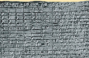
Detail of a table of payments to temple officials, from Sumeria (2500 BCE
Consider, for example, the use of tables to display data. In a 2003 book, The History of Mathematical Tables, Martin Campbell-Kelly traces them back to 2,500 BC in Mesopotamia. These civilisations used cuneiform tables, poked into clay tablets, for tax records, crop yield data, stock lists, or in the example I showed on screen, a record of monthly pay for temple officials.
Tables astronomical, trigonometric and logarithmic were all essential tools for scientists in the pre-computing age. I showed our audience the Port of London Authority tide-tables for 26 January 2017, showing that at London Bridge the tide had been ebbing for an hour and a half by the time I spoke.
Not that long ago, the Ready Reckoner book of precalculated tables was an essential aid in retail. My example was a retail ready-reckoner presented in farthings, up to the value of nineteen shillings. Suppose I want five gross – that’s 660 – of large coach-bolts at one shilling and fivepence three farthings each, what will that come to? Find the page, find the right line – that will come to … ah … 48 pounds, 16 shillings and one threepenny bit.
Ready reckoners are still in use; I showed a recent colourful and Web-hosted one from the Health and Safety Executive, helping to assess the risk of ‘white finger’ from exposure to various degrees and durations of vibration. Increasingly these are replaced by online calculators, so you just put the relevant figures in a box, press a button and there you are.
Diagrams: accuracy or simplification?
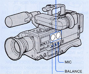
Line diagram from a Sony V5000 user manual, using graded line weights. Tints and second colour selectively draw attention to specific features of the machine.
A more glamorous form of communication than the data table is the diagram. In some cases, a visually accurate representation is the ideal. At the University of Glasgow where I was a student of the history of science, we had a beautiful facsimile edition of Andreas Vesalius’s 1543 book De humani corporis fabrica, with its wonderful wood engravings. That was a great advance on 13th century anatomy drawings, which were more like schematic diagrams. Accuracy was also literally a matter of life and death in creating maps for navigating the seas.
Information designers get excited when illustrations – and maps – are simplified as an aid to understanding. It takes fine judgement to decide what to emphasise and what may be safely left out. Line art is often preferred, and there is a kind of ‘grammar of diagrammatic drawing’ using a palette of graded line thicknesses. My 2003 illustrated article on this subject (‘Line thickness, a means of expression’), originally published in Swedish, is available for download; it also gives some hints about how to implement this drawing style effectively with electronic illustration software.
Technical and medical illustrators have a repertoire of other non-naturalistic drawing tricks to help people better understand the workings of complicated objects, such as the cutaway and cross-section, and the ‘exploded’ style of showing how components fit together.
Showing the way
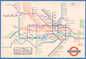
Harry Beck’s original diagram of lines and stations on the London Underground in the 1930s.
Harry Beck’s diagram of the London Underground has an iconic status for information designers, and its principles have been widely copied in cities around the world. Beck was an engineering draughtsman in the London Underground Signals Office, and his idea for a schematic diagram of the Tube lines and stations came to him in 1931 while working on an electrical circuit diagram. Prior to this, maps of the tube services were more geographically accurate, but as confusing as a plate of spaghetti, especiually for Central London.
Beck thought passengers primarily wanted to know where to change trains, and that a schematic diagram with colour coding would express this more clearly. When London Transport tentatively published and distributed a short print run, it was enthusiastically received and before long millions had been produced.
Colour printing was an important technical enabler for Beck’s diagram. (Monochrome versions which code the different lines with patterns in place of colour have also been produced, but are harder to figure out.) More recently, the same ‘topographically transformed network diagram’ approach has been applied to bus services in London, with a small number of customised local ‘spider’ diagrams attached to bus shelters, and bus stops, taking advantage of short-run digital colour print.
There’s a whole field of application in information design called ‘wayfinding’, or alternatively ‘wayshowing’: helping people find their way around complicated spaces such as museums, hospitals, airports and railway terminals, and the road system.
Data illustrated
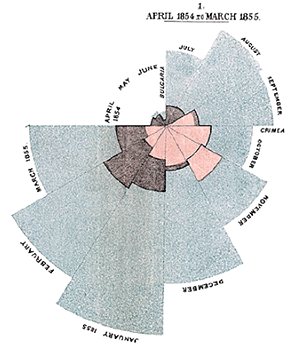
One of Florence Nightingale’s ‘coxcombs’: ‘Diagram of the Causes of Mortality in the Army in the East.’ Each wedge represents a month; the red areas represent deaths from wounds, the outer blue areas ‘Preventable or Mitigable Zymotic diseases’.
Then there are data graphics. In 1786 William Playfair invented line, area and bar charts for presenting economic statistics. He also baked the first pie chart in 1801. Though Florence Nightingale is thought of as ‘the Lady with the Lamp’ in Crimea, she was also an outstanding statistician and used an innovative form of the pie chart which she called a ‘coxcomb’ to persuade Members of Parliament of the need for improved sanitation and care in military field hospitals.
Sometimes it is important to present data in relation of geographical space. Dr John Snow must get a special mention for his map of clusters of cholera cases in Soho in the outbreak of 1854. Joseph Minard’s ingenious ‘Carte Figurative’, which shows Napoleon’s army falling apart in the Russian campaign of 1812, is a celebrated combination of a timeline, a schematised geographical map, and a data display of temperature and troop losses.
Concept diagrams
Diagrams can also represent concepts or entities and how they are linked: the general term is the ‘network diagram’. NetIKX members may remember the meeting delivered in 2016 by David Wilcox and Drew Mackie (see my report at www.conradiator.com/kidmm/netikx-mackie-wilcox.html and on the NetIKX blog) which featured social network diagrams, managed in their case by online Kumu software.
Entity-relationship diagrams (ERDs) and flow charts are also used to model software and data systems and business processes: as an example, I showed an ERD I created to document proposed data flows and user interactions within an online film school. For this, I used the free-of-charge software yEd.
Forms
The form, in the sense of a business form or data collection form, has an uncertain history – the Victorian engineer Charles Babbage has been credited with their invention, in his book ‘On the Economy of Machinery and Manufactures’, but I don’t know how true that is. Today our interactions with business and government are often mediated by forms, whether on paper or online. Not only can they be a tiresome burden to those who must fill them in, they are also a source of miscommunication if badly worded and confusing, and an expensive waste of time in correcting errors in data collection.
Forms are a peculiar mixture of abbreviated language combined with visual devices and cues. Forms design is an information design speciality in itself in which I have little expertise. Ruth Miller has been involved in this field, and I thought it wise to leave the topic to her.
In the UK, Caroline Jarrett of Effortmark Ltd is a forms and survey design expert who has worked with a number of government departments. David Sless’s consulting business, based in Australia, is also involved in systematic analysis and redesign and testing of forms, and he explained his methodology in some detail in an interview I conducted with him a few years ago, the audio of which is available for download online (available from the resources section at the foot of this page).
Emerging communities of practice and theory
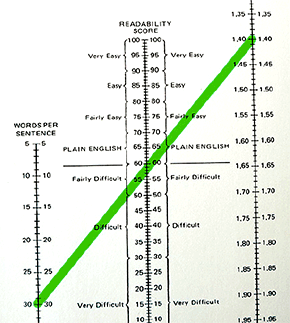
Flesch Readability Chart. The scale on the right is for average words per sentence in a text sample; that on the right, average syllables per word. Draw a line between the two to find ‘readability score’ on the central scale.
So far I had shown more visual examples of information design and touched on various areas of application. Next I offered a brief history of how some kinds of theory and practical rules of thumb arose, and how communities of practice and professional organisations were formed, especially after World War Two. New design and communication technologies also came to influence how writers and information designers worked.
I think attempts at a ‘theory of understandability’ first arose in relation to the written word, starting with Nikolai Rubakin’s 1889 study on readability in Russian. He proposed that the main blockages to easy comprehension were long sentences and unfamiliar words. Similar suggestions, and what were touted as objective indexes of readability, were put forward in the USA by Rudolf Flesch in the 1940s, and Robert Gunning. They both rated the comprehensibility of writing by average sentence length, and the prevalence of polysyllabic words. Flesch and Gunning both worked with journalists to promote simplified language.
Flesch wrote a number of books about simplified language in business and legal communication. Perhaps his most widely known book was Why Johnny Can’t Read, and What You Can Do About It. He made the case for phonics in teaching reading, and this inspired Dr Seuss’s The Cat In The Hat!
With regard to the reform of official writing in Britain, a key figure is the civil servant Sir Ernest Gowers with his pamphlet Plain Words in 1948 and the expanded volume The Complete Plain Words in 1954. Revised several times since, it’s never been out of print. I left it to Ruth to say more about the Plain English Campaign, founded 1979.
The Second World War and ‘tech comms’
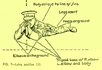
Illustration from 1941 Home Guard training manual. Military needs for documentation and training materials led to the emergence of ‘Technical Writer’ as a job description.
The Second World War had an impact in pushing the case for clear communication. In the Armed Forces and supporting industries, people had to be taught to understand weapons systems of increasing complexity. The scale and speed with which military personnel were recruited and trained pushed a demand for accurate systems documentation and lucid training materials. The job title ‘Technical Author’ was used for the first time. This trend was not only carried further in the Cold War, but spread to other complex industries such as civil aviation, engineering, and in time to computing and consumer electronics.
In the UK, the Presentation of Technical Information Group was founded in 1948; it became the Institute of Scientific and Technical Communicators in 1972. The US equivalent is the Society for Technical Communication, which was a merger of three regional groups founded in the fifties in Boston, New York and Los Angeles. STC now has many international chapters.
Technical communication is an eclectic trade. Many practitioners originally worked in science and engineering, and switched to writing and editing later. Especially in the States, aerospace and other wealthy industries were prepared to spend big bucks on early experimental workstations and documentation software from IBM, Xerox and Interleaf, and later on the more affordable FrameMaker (which was a big favourite of mine) and Ventura Publisher.
In early January 2017 Jen Lambourne, one of four technical writers at the Government Digital Service, wrote an intresting blog post about the growing need for technical writers in government service. The ongoing ‘digital by default’ drive in government means that departments increasingly need people like Jen who can understand technology, document it, and explain it simply to their colleagues. (See Jen’s post at https://gds.blog.gov.uk/2017/01/12/growing-technical-writing-across-government/).
Applying cognitive psychology at the APU
In 1943, in the middle of the war, the Medical Research Council set up the Applied Psychology Unit in Cambridge (APU), initially focusing on information assimilation and task performance by military personnel working under stressful and distracting conditions. This, and similar initiatives, created a valuable partnership in which cognitive and experimental psychology began to support clearer communication, and interface design.
Psychologist Pat Wright, a former employee at the APU and now an Emeritus Professor at Cardiff, helped lay the basis for well-designed legibility research, and studies about human-to-document interactions. She was a very valued member of the Information Design Association from the beginning.
The American Don Norman was also at APU for a while. Don’s training was in electrical engineering, computing, and experimental psychology: he was one of the people who got the idea of Cognitive Science off the ground academically. A pioneer in thinking about computer interface design, Don worked for a while at Apple as their first ever User Experience Architect. He’s written several highly readable books about interface design and what we may call ‘cognitive human factors’.
A certain amount of theoretical influence on graphic designers in particular, trying to understand how people comprehend pattern and salience, came from the Gestalt school of psychology (not to be confused with Fritz Perls’ ‘Gestalt therapy’). The Gestalt approach had been fostered at the Berlin Psychological Institute by Wolfgang Köhler and colleagues in the twenties and thirties.
Origins of the IDA
Papers from the 1978 Het Vennebos conference
In Britain, there was a growing perception that a cross-disciplinary practice of communication design was emerging, in contrast to the more fêted practices of advertising and brand identity and magazine design. However, the range of information products they were involved with couldn’t exactly be described as technical communication. We’re talking about telephone directories, statistical presentations, medical information, utility bills, government forms, public signs, transport maps and timetables, educational and training materials and so on. It’s a long list.
In September 1978, NATO sponsored a conference in The Netherlands, and the papers were published in 1984 as Information Design: the Design and Evaluation of Signs and Printed Materials. The Information Design Journal was founded just after this conference. That was the first outing of the term ‘Information Design’. Rob Waller, one of the founding editors, explains what they meant:
‘Certainly we had a distinctive meaning for [Information Design] – to apply processes of design (that is, planning) to the communication of information (its content and language as well as its form).’
The label stuck, there was a series of readers’ conferences; then the IDA got going in 1991. Early in its life there was a mild tussle about whether we were trying to found a new professional organisation, but we stayed an informal society, not unlike NetIKX, but with marked academic as well as industrial links. We organised several international conferences as well as evening meetings in London.
Topics at IDA events have included bus transport mapping, news and data graphics, communicating national census findings, custom typeface design, health information for ethnic and linguistic minorities, the design of utilities statements, the wording of laws and contracts… and I remember one meeting where James Souttar, Rachel Kellett and I introduced the audience to a wonderful new technology called the World Wide Web.
The IDA is not as active as it used to be, but still holds occasional meetings in London and I believe is planning an international conference. In recent years it has taken rather more of an ‘academic turn’.
Some issues, trends and developments
‘Desktop Publishing’: The Information Design Journal was five years old when the Apple Mac came out, and later GEM and Windows, and affordable design software like PageMaker and Ventura Publisher, and typefaces that could be scaled from tiny to enormous, and laser printers with pretty-good resolution and the ability to print graphics too.
For graphic designers who until then had had to implement work indirectly by using typesetting shops, this was hugely liberating. It was particularly useful for Information Designers and technical authors, many of whom want to be able directly to control such things as where lines of type and pages break, to avoid confusing the reader.
As an example of what such tools made possible, I showed a page from the user manual for Ventura Publisher software (version 3 for Mac, 1990). Using the limited range of computer fonts then available, the design makes good use of side-heads, inter-line and inter-paragraph space, bullet lists and such to help explain things to the user.
Understanding the reader or user. It’s often a challenge to understand the people we are trying to talk to and help: what motivates them, distracts and worries them, what meets their personal goals. Imagine you are asked to produce information for a local council: about waste recycling, say, or housing benefit. You’ll be briefed by officials. But the people whose world you really need to understand for such a project are residents and potential claimants, whose understanding, vocabulary, abilities and values are very different.
Advertising and marketing people suggest using market research methods. That can help, but too much relies on questionnaires, which predetermines the range of answers you get. Qualitative methods such as focus groups may be better. If you were at Ron Donaldson’s NetIKX talk last year, you’ll remember how he uses anecdote circles and other narrative methods to gain insights for service planning (see my report of that meeting HERE).
Prototyping and testing. Desktop design technologies have also make it easier to try out alternative solutions, cheaply print a few copies, assess and refine designs with colleagues and even test them on a sample of your intended victims – I mean users. But information designers in commercial practice have found it hard to persuade clients that testing is worth spending time and money on. Again, the argument for testing is powerfully made in David Sless’s interview.
A notable exception, thanks to EU regulations, is pharmaceutical information such as the Patient Information Leaflets stuffed inside boxes of medication. To sell medicines in the EU, you have to prove that the average reasonably literate person can find and understand 90% of the information on such a leaflet. There are similar mandatory requirements for medical devices such as spinhalers and glucose meters. This has fostered a small industry of testing the understandability of medical information for patients.
Summing up
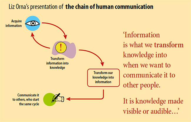
I wonder if the world of information and knowledge management has been too much dominated by librarians, records managers and archivists, with their focus on collecting, curating, organising, categorising and analysing the objects that knowledge is contained in. But information has no value outside what Liz Orna has called the chain of human communication, as I illustrated with a diagram reconstructed from one of her books. A vital link in the chain, and it is all too often a weak link, is the craft of organising knowledge, facts and ideas into clearly-written, well designed, easy to understand information products.
Other resources
Some design/information design sites
- The Information Design Association, founded in 1991, is based in the UK and runs occasional evening meetings in London and a series of international conferences.
- The International Institute for Information Design is headquartered in Vienna.
- The Simplification Centre is a volunteer network which looks at simplifying difficult communications in common use. The director is Rob Waller, who was the founding chair of the IDA and a founding editor of the Information Design Journal.
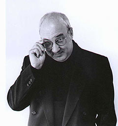
Davis Sless of the Communication Research Institute. Photo by Lorna Tilley.
2006 audio interview with Prof David Sless
Conrad Taylor talks to David Sless of the Communication Research Institute. David outlines how philosophy can be practical, and explores links to Wittgenstein’s later thinking and the study of ‘pragmatics’ in linguistics. He also sketches a method for analysing documents and detecting their ‘pathologies’ before trying to fix them (and then, testing whether they got fixed). Interview 63 minutes in total.
- Stereo
version of Sless interview
Right-click above link to download; 58 MB. - Mono
version of Sless interview
Right-click above link to download; 27 MB.