1: Hand-drawn illustrations
At our secondary school in Scotland, art was regarded as a subject for dummies. As I was in the Sciences stream, I had no formal art education but taught myself how to draw – from books, and with extensive practice.
I worked in monochrome media because pencils and pens and ink were affordable and paints and canvas were not. Increasingly I concentrated on high contrast line art drawn with technical pens and sable brushes, and shaded with hatching and cross-hatching strokes, because these were easier to reproduce en masse by litho printing or with electrostencil duplication.
Planting rice seedlings near Chiengmai (1979)
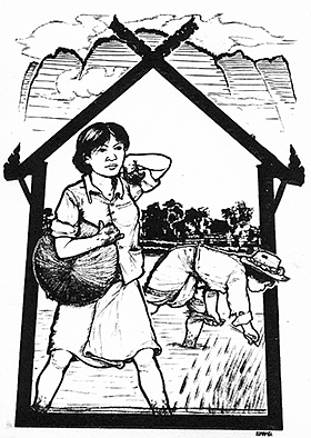
Brush-and-ink Illustration drawn in Chiengmai, Thailand
In 1979, aged 24, I quit my job at the Third World First campaign and embarked on five months of travelling in Thailand, Malaysia and Singapore. I carried with me a pad of good quality heavy drawing paper, so-called ‘Indian’ ink and a few Windsor and Newton Kolinsky sable brushes: the fine hairs of these are very springy and capable of very fine lines in a steady hand (to which at age 62 I can no longer lay claim).
While I was in the North of Thailand the time had come for the farmers to plant out the rice seedlings which had been raised in a nursery bed. The padi fields had been flooded and the ground ploughed up into a fine mud beneath the waters. Without farm machinery, transplanting rice like this is an arduous and back-breaking chore. The central activity has been framed in a shape like traditional wooden village houses and in the distance is a representation of the northern mountains.
Part of the graphic language which I evolved is to imply the shape of masses such as faces, limbs and clothing with lines which vary continuously in thickness. This was not difficult to do given the springy nature of the sable brush. I would first prepare the brush by dipping the leading millimetre into ink and letting it clot slightly, so that the brush tip would cohere better.
I later had a set of cards litho printed from this art.
Banteng: the Dream of the Crows (1979)
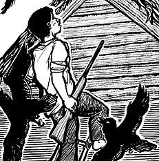
Central detail from The Dream of the Crows.
While staying in Petaling Jaya, Malaysia, I was asked to draw an illustration to accompany a story in Nadi INSAN (‘Spark of Humanity’), the magazine published by the Institute of Social Analysis.
The story was about a poor Malay farmer in Banteng who had a metaphorical dream in which he was attacked by a flock of crows. My representation of this dream, rendered in brush and ink, may have been influenced by Alfred Hitchcock’s film, The Birds.
The image is typical of my brush and ink work with Kolinsky sable brushes. The timber grain and some of the other textures were rendered with an ink-hardened brush splayed into multiple parallel points.
The small image shown here is a detail; you may wish to see a larger view of the whole image. It looks more scary when you see the whole thing.
Rubber tappers in Malaysia (1979)
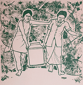
Screen print from Rubber Tappers drawing
Also during my Southeast Asian trip in 1979, I spent some time in the company of Cecil Rajendra, poet and barrister. He was doing some work to represent the rights of rubber tappers on the large estates, and I spent a few days observing how they worked.
The trees are ‘tapped’ in the very early morning and the fresh latex drips down a spout into a small bowl. Later in the morning, the workers come along with big buckets like these and empty into them the latex from the small bowls. As they fill up, they get too heavy for one person to carry, and this is the stance they adopt with one arm bracing them apart so they won’t knock their heads together.
I collected some rubber tree leaves, and once I had done the drawing, I masked the figures, inked the leaves and used them to print a background texture.
In 1982 when I was at Goldsmiths College for a while, I used this image as the basis for a screen print, with a small run of fifty copies which I gave away. I ended up with none for myself, but here is a photograph of the one my mother has framed and keeps on the wall.
You may wish to see a larger view of the image.
Inside our Thamesside whale (1982)
Detail of illustration for Thamesside Adult Education Institute poster: brush and ink on white scraperboard.
Here, the commission was for a poster advertising the wide range of adult education courses on offer at the Thamesside AEI. The copy and concept I had been given was, ‘See what’s inside our Thamesside whale!’ and I drew a rather square sperm whale as a frame for the lists of courses. On the back of the whale I drew three characters – one was peering down the whale’s blow-hole!
In this detail you can see a variation on my shading technique. The drawing was made as usual with sable brush and ink, but onto white scraperboard rather than paper or card. Using a sharp scraper, I then cut through some of the inked areas with cross-hatching lines, white against black. The result looks somewhat like wood-engraving, but with less pain.
During the nineties, white scraperboard was pretty much impossible to buy, but I had a stock of 20 or so boards. In 2001 when on a trip to Ghana I made the acquaintance of a commercial artist, Kofi Aryee, whose own style relied heavily on this technique and he too was starved of material. I reckoned his need was greater than mine, so when I got back to England I posted my stock of scraperboard to him.
‘Laang Pao’ (Genocide) (1985) (shaded with Letratone film)
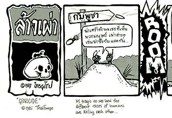
Artwork, ink and Letratone, for a cartoon in ThaiEurope magazine.
In the mid 1980s, my wife Sang-usa (Noi) and I found that in some way we had inherited responsibility (from her sister Yee and our journalist/photographer brother-in-law Tanya) for the small-circulation magazine ‘ThaiEurope’ — written for Thai people living in Europe, and produced in Thai and English.
We acquired an Olympia Supertype BT bilingual Thai/English daisywheel typewriter (cost: 40k baht) for text composition, and I did the illustrations. I think the printing was by the Rye Express print co-op, in New Cross in South London.
Later (1987?) this reduced its scope to a simple newsletter on stapled A4 pages, called ‘SiangThai’ (Thai Voice, or the Voice of the Thai) — the pages composed by Noi in PageMaker software on a Macintosh Plus computer, after we had tricked the beast into setting Thai type characters.
Here is a detail from a cartoon I drew for ‘Thai Europe’ called ‘Genocide’, drawn when there was still a major stand-off between the Thai military régime of the time and the Vietnamese-backed armies of Hun Sen in Cambodia. The gag is not novel to me; I think I adapted one from Johnny Hart’s cartoon strip ‘BC’ and the message is universalist pro-peace and anti-racism. The Thai lettering is mine, some in brush strokes, some using a tube-nibbed technical pen (Røtring).
The relevance here is that the art was drawn by hand, but shaded with Letratone. Letratone was a thin plastic sheet material, covered with printed shading dots, the reverse face of which was covered with a medium-tack adhesive. I would roughly cut out a large enough area to cover the artwork, peel it from its protective anti-stick backing, and rub it lightly onto my drawing so it wouldn’t slide around. Then I’d take a really sharp Nº11 scalpel blade, and trim off the bits I didn’t want on the artwork. Finally, I’d cover the Letratone with some silicone coated paper and burnish it down hard.
To appreciate better the size-for-size appearance of the Letratone shaded artwork, I suggest you click here to inspect the artwork closer.
The gag: Unfolding across six frames, the lead ant says — ‘It’s tragic how the various races of humans fight each other. The Khmer fight the Viet, the Viet fight the Thai… at this rate, humans will soon wipe each other out — then ANTS can inherit the earth!’ To which the other ant asks — ‘Red ants, or black ants?’
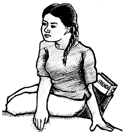
A desktop publisher (pencil, ca. 1989)
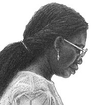
Detail, pencil drawing on Schoellershammer board.
Here, for a change, is a pencil drawing. The subject was a lady who used to work as a compositor at Jubal Typesetting in Loampit Vale, Lewisham, where for a while in the early 1980s I had a studio. I took a photograph of her at the console of the Quadritek typesetting machine. Years later, I wanted a picture to represent somebody using desktop publishing software and I used that photo as a reference image.
There is a story behind how I learned the pencil technique used here. Before I found Jubal pretty much on my doorstep, I had used the typesetting services of an Indian lady in Bounds Green, Shanta Thawani. She did quite a bit of work for small publishers including a gay men’s imprint, so sometimes I bumped into their people while collecting galleys or dropping off marked-up manuscript. And one time, they invited me to come to their next book launch party.
The book was a collection of erotic gay drawings in pencil, and I admired the detail and delicacy of shading, to I chatted to the artist to discover more about his technique.
His secret was an amazing type of illustration board called Schoellershammer 4R, in which a tough surface paper was bonded to a very hard board substrate. You could use the hardest, sharpest pencils and by pressing hard you could work up a darker tone than on ordinary drawing papers, and the surface also took erasure well.
I have done a few portraits using these materials, but I confess I am a very slow worker when it comes to pencil drawings of this type.
The small image shown here is a detail; you may wish to see a larger view of the whole image.

