

A 2004 conversation with John Warnock,
founder of Adobe Systems
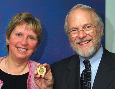
Dr John Warnock receiving the BCS LoveLace Medal
from Professor Wendy Hall, then President of the British Computer Society,
on 13 May 2004.
On 13 May 2004, Dr John Warnock, co-founder of Adobe Systems and the inventor of PostScript and PDF, was in London to receive the Lovelace Medal award from the British Computer Society, and to give a lecture on how PostScript and PDF were invented.
The following week, I met John at his hotel for a recorded conversational interview. When I’d attended Seybold conferences in San Francisco in the ’nineties, I always found John to be extremely approachable. We talked about modern digital type design, typesetting, and computer graphics.
This interview is also downloadable as a PDF
How John Warnock got into computing
Conrad: I remember you were once interviewed for a Microsoft Press book [‘Programmers at Work’ by Susan Lammers], and you were asked for advice about doing computer studies. You said, ‘Never do computer studies as a first degree, because everything you learn will have gone out of date by the time you qualify – you’d better study something liberal, like history, and earn to think first.’ What was your own route into computing?
John: I studied for my undergraduate degrees at the University of Utah, and got a double major in philosophy and mathematics. But I also took a wide variety of other subjects… interestingly enough, no engineering courses. Some literature courses, some philosophy courses, history and general science; but mostly mathematics.
Actually I was going to be a mathematician. But when I was getting my Master’s degree in mathematics, I had a very bad summer job recapping tyres. And I decided that was crazy, because I was well-educated; so I got a job at IBM in 1963. That was my first introduction to computers, and they sent me to about six months of training schools, where I learned to wire panels, and program in Fortran, and things like that. When I came back to the University, and got married in 1965, I found that I could make a lot more money in the computer centre than I could make teaching mathematics.
Conrad: Did the appeal of computing also have something to do with wrestling with a problem? For example, I’ve seen people trying to create Web pages things in HTML, and the first three attempts don’t work out right; then they find they missed out a quote mark, it works, and they punch the air and say ‘Yeah, it works!’ So you’ve got that kind of achievement, of getting something that actually works.
John: Yes, I’ve always found that very satisfying about dealing with computers. You have a very objective measurement of when things happen, and you got it right! But, for me, programming came after a very long bout with theoretical mathematics.
Introducing computer graphics
Conrad: And why computer graphics? Why were you interested in the problems of graphics rather than anything else?
John: Well, I’ve always been interested in geometry. And I’m an amateur artist – I paint a great deal, I’ve drawn since I was a very young person, and I enjoy it very much. And so I find I’m one of those people with both sides of the brain active. I’ve always been very visually oriented and graphically-oriented, so graphics was, I think, natural for me.
Conrad: And at the University of Utah, Ivan Sutherland was professor there, and David Evans…
John: Yes; and Tom Stockham. I was working in the computer centre, and Romney came in – I’m trying to think of his first name – anyway, Romney was working on the hidden surface algorithm, and I said, Gee, isn’t there a simpler way to do this? And I came up with an algorithm, that then became my PhD thesis.
[NOTE: G. W. Romney worked with Evans and Sutherland on the problem of removing ‘hidden surfaces’ from 2-D graphic representations of 3-D geometrical spaces, which was vital to the work Evans and Sutherland were doing for simulators for e.g. NASA and the New York port authority. John Warnock invented the ‘Warnock Algorithm’ (see Wikipedia) in his PhD thesis in 1969: ‘A hidden surface algorithm for computer generated halftone pictures’.]
Cubic equations and Bézier curves
Conrad: Meanwhile, Paul-Etienne Bézier was working at Regie-Renault and trying to find a neat way of describing the curves of car bodies. He wasn’t alone in that; I think there were teams at Toyota and Chrysler and General Motors doing much the same thing. They were all experimenting with different spline curves, but Bézier decided to play around with cubics… when did you bump into that work? Is that anything to do with the hidden-surface removal problem?
John: No, no. I actually bumped into that mostly at Xerox, quite a bit later, thanks to Martin Newall. I’d already been exposed to the mathematics of Bézier, but not to the wonderful geometric contructions that are associated with it, and the very, very simple computer implementations associated with Béziers. And so once I learned about that it because very natural, very easy to program, very easy to deal with in the computer. I thought all other approaches were silly, after that!
Conrad: Because, for instance, in the Metafont project, hadn’t Donald Knuth had been working with spline curves?
John: No, he worked with very complex variables – in complex variable space – because obviously Knuth had not run into Béziers. If he’d had Béziers, and parametric representations, he would have not gone down this incredibly complex path of complex variables that he went down in his first Metafont book. He sort of pretends [now] that none of that ever existed – and he talks about Béziers, and uses those as if they came out of whole cloth! It’s really funny.
Conrad: My understanding is that you are talking about them being particularly easy to implement – that they become easy to work with once you can start moving co-ordinates around on a computer screen, by grabbing anchor points and control points, and moving those around, with a mouse.
John: But, you know, nobody did that. It was actually in Illustrator, the first time we ever actually implemented that in a drawing program. And it was totally obvious to me that you should give users control over the control points, rather than have them draw the curve first hand.
Making fonts with Béziers
Conrad: I heard from Erik Spiekermann that Illustrator itself had its roots in a tool that you needed to create at Adobe for digitizing typefaces.
John: That’s right. We decided on using the Bézier control points, and our first approach was to go along the curve [marking points], and then [get the machine to] approximate the Bézier curve that would best fit that…
Conrad: Like URW’s IKARUS system for font digitization, or the stuff that Bitstream used?
John: Yes, right. The earlier things that came out of Bitstream were all around conics, and people used pieces of circles and conics to approximate the curves.
But cubics were much easier to deal with, and after PostScript got established we said, Gee, we really need a font drawing program. I said, let’s be very straightforward about it, and have people put down the control points, and allow them to control the control points, and control the curves that way, and that’s where that came from.
Mike Schuster did a little prototype called Picasso, which was the precursor name. It had several names: ArtiFactory was one of them. It worked very well. Once people got used to it, they could control; it; and then we started using that for type design.
Emergence of ‘Adobe Illustrator’
Conrad: You know, the first time I saw your face was on a videotape which shipped with Illustrator when it was first launched in 1987. Adobe didn’t yet have a UK office, so someone from McQuarrie Systems came to show Illustrator to group of medical illustrators, and Doig Simmonds who ran the medical illustration department at the Royal Postgraduate Medical School smuggled me in.
John: That video demo tape was shot live, with no editing. We didn’t have video production tools at that time, and we didn’t want to pay for a professional to do it, so I did the demonstration.
Conrad: The funny thing for me was that, as far as Bézier curves were concerned, I ‘got it’ from day one. I wonder if it is because my background includes a lot of the practice of calligraphy. It’s almost as if I had been looking for Bézier curves in graphics packages like MacDraw and not finding them. I took to them immediately.
It seems to be that Illustrator always works best when you’ve got something to base it on, to trace over; something like a pencil sketch But that was before I bought my first scanner, the ‘Thunderscan’…
John: Yes, I remember Thunderscan!
Conrad: A Buddhist friend had shown me how to construct the geometrical armature to do Tibetan iconic paintings. I made an armature in MacDraw and imported it to Illustrator. So then I spent a weekend doing an image of ‘Aryatara, Boddhisatva of Divine Compassion’ in Illustrator…
My first Illustrator image.
John: I did a rose for my demonstration; I don’t know if you remember the rose in the video. I did a pencil sketch of the rose and then did that in Illustrator.
Conrad: I remember the rose! Anyway, it seemed to me that Béziers were what I’d been waiting for all my life. And it seemed to me that they were a completely natural fit for a lot of existing typefaces. As if some of these seventeenth and eighteenth century type designers had been wishing they had Bézier curves when they designed those old types!
John: Yes. I think it is a natural fit. And the tool we use at Adobe for making type now is a kind of beefed-up internal Illustrator.
Conrad: Bézier curves also seem a good match for many natural forms: muscles, or the curves of plants, or such.
John: Yes, you get these very natural inflections.
Font rasterisation and hinting
Conrad: At the lecture last week you talked about ‘hints’ in PostScript type. That wasn’t entirely news to me. Shortly after the PostScript Type One file format was released from under wraps, Adobe published a book about the format, which I read. I remember it mentioning the ‘blues’, but I can’t recall reading about the ‘yellow’ hints.
John: It didn’t tell you how they were used, but it told you to ‘put them here’!
Conrad: So in fact what was happening – what you called Adobe’s ‘dirty little secret’ last week – was that the rasteriser would be given the PostScript findfont command; it would go and retrieve the data set from the ROM, so now it had all of the co-ordinates. It’s got the scalefont command at that point, and because it is a raster image processor for a particular device, it knows what pixel grid it is working against. Then you have a procedure that actually starts moving the coordinates in advance of rasterising them, using the hints.
John: That’s correct.
Conrad: Also I remember that the difference between TrueType hinting and PostScript Type One hinting was that the ‘cleverness’ was there in the rasteriser for PostScript hints, and so could be improved in future versions of the rasteriser.
John: And it also worked globally across fonts, this same procedure, whereas TrueType is hinted font by font by font. And that seemed to be very problematic, because you would have very bad TrueType fonts and very good TrueType fonts, depending on how much work you had put into them.
Conrad: And the reputation of TrueType suffered, I think, from an early release of some pretty bad TrueType fonts.
John: When Bill Paxton created Adobe Type Manager, he also kept the same strategy: you solve the problem globally, and figure out how best to match the frequencies of the outlines with the frequencies of the rasters, and go from there, rather than having font-by-font work.
Conrad: And you can even take it further and customise the returned output to the specifics of the type of display, so ClearType comes into that as well.
John: Yes. Well, there you don’t have a binary device any more, you have a sort of semigreyscale device, and you can use the extra information to produce better stuff.
Conrad: Actually, I first saw that kind of thing at Bitstream, I think in 1988. They were playing with prototype rendering engines for anti-aliased type and saying, ‘We don’t know if anyone will be able to use this!’
John: Actually, I published a paper in 1982 at SIGGRAPH on anti-aliased type, and gave all the examples of what works and what doesn’t work.
Conrad: Bitstream didn’t seem to do too badly when they produced the TrueDoc renderer. They seemed to solve that problem of when you get really mucky anti-aliasing, and you don’t get really clean horizontals and verticals.
John: Well, it turns out that if you use the hints as well, then you can get really nice antialiasing.
Conrad: So that’s what your current implementations would do.
John: Yes.
Multiple Master fonts, and Acrobat font substitution
Conrad: Moving on a bit… You, I mean Adobe, have participated in various ‘adventures’, if you like, to try to expand and improve upon what typographic possibilities were there. But here, I think, you started to bump into firstly some messy Gresham’s Law type market realities, and also the divergence between what owners of different operating systems wanted to do. I’m thinking here both of the QuickDraw GX project of Apple, and Multiple Master Fonts. Shall we start with the Multiple Masters? Can you tell me the story of how they came about?
John: It occurred to us that if you had two outlines, and they had the equivalent one-to-one matching set of control points, that you could just do linear interpolations. It actually came out of the blending technology in Illustrator. So with one set of baseline designs you could get a continuum of weights, a continuum from condensed to extended types, and you could even get optical scaling between various sizes.
It worked extremely well, but you’re right, it had a bunch of gnarly things that the operating system needed to get involved in, and also all of the applications needed to get involved in it. It was even hard to get Adobe’s applications to support Multiple Masters!
Conrad: Yes. I would say Illustrator does it best…
John: Yes; and it was really important in the Acrobat work, because there it was really important to do the font substitution.
Conrad: That came along as a sort of happy accident, I take it?
John: No, it came from a set of experiments that I did. I actually own the font-substitution patents around that. But I said, Gee, we could use the same idea to build really good substitution fonts for any set of metrics. I did a set of experiments, and it worked!
Conrad: One of the PDFs I’ve given you was made in 1993, my paper ‘Type’s Trajectory, from Ikarus to Acrobat’. It happens not to have the fonts embedded, so if it looks a bit funny typographically – well, you know why, and whom to blame!
John: Right, myself!
Conrad: So, there were implementation problems, with Multiple Master Fonts. One would have to use Super ATM to create ‘instances’ of Multiple Master fonts and use them. And it brings up all sorts of nightmares about design and type specification, especially in organisations.
John: Yes, it does. I agree.
‘Warnock Pro’
Conrad: Jumping a little bit ahead now… I have on my computer the Adobe font family ‘Warnock Pro’, which is a Robert Slimbach design, is it not?
John: It is. It was my son that suggested it, and Robert, being Robert, took him up on it.
Conrad: And Warnock Pro has lots of weights. And lots of variants that are optically tuned for use as display type, or at subheading sizes, or for text, or captions and other small stuff. This is more than a type family now, it’s become a tribe.
John: Well, Robert got very good at producing Cyrillics and really, really complete character sets. And for special applications where you have the requirement, it works really well.
Why Adobe steered clear of operating system peculiarities
Conrad: Apple had even more problems with some of their projects, such as OpenDoc.
John: Yes. Never went anywhere. And actually, their QuickDraw GX, I don’t know of anybody who used it, because everybody had their own graphics machinery.
Conrad: I can think of two examples. ReadySetGo transformed into a program that worked with GX, and was enthusiastically taken up in the Arab world, where it was used for typesetting a lot of newspapers. Obviously with Arabic, you may have a single character that can be represented by any one of four glyphs, depending on whether it stands alone or is initial, medial or terminal in a word. ReadySetGo employed GX technology to handle this with aplomb. So GX met with use in some specialist markets that needed it, but never had the fuel of the mass market behind it to make things cheaper.
And when you have a company like Adobe who are trying to deliver equivalent functionality on the Windows and Macintosh platforms; and, for some applications, on Unix as well…
John: Well, it’s really funny, because we had a person from Microsoft come down to tell us about their latest operating system; and they were under the impression that we used all of their stuff – that we used their GL Library and all of the graphics libraries that they have. And we said, well, no, we don’t use any of it. We’ve always done it our own way, so we can move across platforms and remain independent of operating systems. It saves us a great deal of money and a great deal of testing, and a great deal of hassle. They were amazed.
InDesign, FrameMaker and document composition issues
Conrad: Is it true to say that InDesign almost incorporates an operating system? You sort of create an Adobe world within which things can happen?
John: That’s right. To do some of the things that they wanted to do in InDesign – you’re right, they had to build this sort of programming world that is really complex. And they did it very, very well. They send messages to these various tools inside that do text layout, and do justification, and do it under the most bizarr general circumstances.
Conrad: It’s all plug-ins, basically, around a little core?
John: Yes, it’s all plug-ins. But not a little core – a very, very complex core!
Conrad: A small, dense core?
John: Yes, a very dense black hole!
Conrad: Let’s not go beyond that event horizon…
Adobe has found itself in the situation of owning three page make-up systems: PageMaker, InDesign and FrameMaker. I’m not counting Illustrator for these purposes. When one starts to think about Adobe getting involved in document composition issues, it’s time to pull out the flipchart and brainstorm about what are the important aspects of document composition to support; which direction to go.
Those of us who use these tools often look around at other software: 3B2 does this, Xyvision does this, Quark does this; wouldn’t it be nice to put them all in the blender, so to speak, and extract one ideal application.
John: Well, that’s a complicated problem. And there’s a fair bit of disagreement inside of Adobe as to what the appropriate thing is to do. PageMaker as a codebase was just very long in the tooth: it was not a maintainable codebase. It was clear when we acquired it that it was not going to last for very long. Too much spaghetti-code: very difficult.
InDesign had just started as a project when we acquired Aldus, and we continued with a very strong group of people: Robert Brainsea and Zak Williamson, and a very strong group of people who built the architecture for InDesign. But they were coming at it from a very ‘let’s go build magazines’ kind of perspective.
Then there was the other set of the world that works with highly structured documents, and the FrameMaker world. And I absolutely love FrameMaker; I’ve been a very strong proponent of FrameMaker. But FrameMaker was also suffering from an old codebase.
Essentially, the idea is to start migrating features over to InDesign. Unfortunately, the InDesign crowd doesn’t understand the structured document world as well as they need to, and so that migration has been coming along more slowly than I would have liked it to have been.
Conrad: Some of the pagination issues, and table-handling…
John: Yes, and cross-referencing, and forward-referencing, and all the things about dealing with highly structured documents. I’m a structured-document person: I like them!
Conrad: You’re in good company here! I’ve been using FrameMaker for Macintosh since version 2.1. And now I shall be using Frame 7.0 on the Mac under Classic mode – for the rest of time, perhaps.
John: Well hopefully someday there will be a version of InDesign that will have the same properties. And to InDesign’s credit, there are people who have done math plug-ins and have started to get the more arcane things into InDesign. But they haven’t fundamentally solved the structure problem.
Handling character sets and glyph sets
Conrad: One of the things that particularly interests me is large character sets, because I have been involved for decades in things to do with development in Asia and Africa.
John: So, UNICODE…
Conrad: Yes, UNICODE’s important to me. I’m also an information designer, and a lot of us working in information design are looking at things like health and development information, and the role that information delivery systems can have in making the world a better place. That would include being able to typeset useful information in Twi or Baule or Bengali.
But there’s another side of me as a typographic designer who is interested in what large glyph sets can provide in the way of fine typography – ligatures, alternate character forms etc. And there are overlaps: the best renderings of the tone and vowel markers in Thai would require contextual forms and contextual positionings Glyph substitution would help here.
Now, I believe Adobe was one of the founding members of the Unicode Consortium, together with Apple and Xerox?
John: I wasn’t personally involved with this. The right person to ask would be Burwell Davis. There’s always been this funny conflict in type design, whether to build massive character sets, or families of character sets.
Conrad: Yes, it would be silly to think that the adoption of Unicode meant that you had to produce a font with 64,000 glyphs in it. What you would need for Bengali is simply to produce a Bengali font, the characters in which can be called by the appropriate Unicode references.
John: Right. I haven’t been intimately involved in that, but I’ve always known what the rationale was for Unicode, and in the world of the Internet you certainly need these kinds of things to be able to navigate and provide an environment where you can handle these languages.
Conrad: But here once again one is at the mercy of the operating systems. Apple seem to be on the verge of ‘getting it’; Windows seem to have ‘got it’ rather better.
John: That’s probably a fair characterisation, but I don’t know what the status is in the operating systems.
I have to say that one of the things that PostScript did really right was not to adopt any character set. We decided to keep this name-space where you could do just about anything you decided you wanted to do. For example, when we went into Japan, there were actually three standards.
We did consider adopting Unicode-type standards when we designed PostScript, and we said, that’s not going to work. What we need to have is a very general, neutral namespace, and be able to map any encoding into any encoding. Even when we were just dealing between the Windows world and the Apple world there were two different encoding sets; and you had to deal!
Conrad: Late binding to the rescue, again.
John: Yes, late binding indeed! In Japan it saved our lives. We couldn’t go to one JIS standard or the other JIS standard… And machines were small then, too. And these were huge character sets.
OpenType; Béziers vs quadratics
Conrad: So what about the OpenType project?
John: It’s just a way of trying to rationalise things so that these two standards, PostScript and TrueType, can co-exist.
The one mistake that I made was that we didn’t publish the specifications of the PostScript Type One format sooner. Then Apple and Microsoft wouldn’t have come along with TrueType. We published the specs in 1989 – you’ll remember the ’font wars’. Had we opened up Type One in 1988, we probably would have had a much cleaner type world.
Conrad: OpenType is agnostic, isn’t it; you can have whatever shape curves you like? Cubic or quadratic?
John: Yes, that’s right.
Conrad: Has anyone ever been able to convince you that there is anything to quadratics that cubic curves don’t have?
John: Never!
Conrad: Can you give me any rational justification for that?
John: I think, if you look at the Roman types or even the Japanese types, the cubics are just so much more efficient. There are fewer points, and they are just as fast to implement; you can scan-convert them very rapidly, you can deal with them – I just don’t see any value [in any other approach].
Conrad: I don’t see how you could draw with quadratics, whereas I could do Bézier curves in my sleep.
John: Yes, I know. And I feel just the same way. I think it’s a better thing. And finally Knuth transferred some of these complex crazy things that he had to Béziers, and said, Gee, those are really nice. Fourth order curves don’t give you anything extra; you can have as high order Béziers as you want, you know.
Conrad: But cubics does the trick.
John: Yes, cubics seem to me to be the most bang for the buck.
Future documents: structure vs appearance?
Conrad: Is there anything you’d like to say about what is important about the future development of digital typography, and the text composition side as well?
John: On the composition side, there really is a place for highly structured documents as well as totally right-brain kind of documents. I hope we can really soon pull those two kinds of worlds together in a rational way, where if the document needs to be reflowed into a different format you can do that, but you can also have design control where you need design control; and that’s a balance between the two worlds. Right now it’s sort of mucky.
Conrad: There’s also an interesting dynamic between those aspects where the person producing a document wants to assert control, and those where it’s appropriate to hand off to the homunculus inside the machine to get it done; and a third area which I think concerns many organisations is the situation where somebody who is rather more expert than the person producing the document can set up the rule structures: stylesheets, templates, reflow rules and so on.
John: And I think right now – well, you read an HTML manual, and the author will proudly say that you have no control whatsovever over what the consumer of the HTML will do with your stuff; and they say that with a kind of pride like, that’s the way the universe should be. And I just think that’s nonsense.
Conrad: I see it both ways. For example I’m involved with some BCS initiatives doing work on disability, and we need for some people to be able to transform documents so they can make sense of them because of their special needs. But you want some kind of well-designed norm from which to deviate.
John: You need to have it both ways. You want to make it possible for people to see it the way the designers wanted it, à la PDF files; or, if you want to say, Gee, here are the rules of engagement, you can deviate from those design rules, only to the extent you have to to get to disability functions, and to other things
For instance, in the world of the Web today there’s no concept of scaling. Photographs don’t scale on the Web; nothing scales. And the world needs that. I mean, really – for accessibility, for reflow, for re-layout, for all of those things. And right now it’s a shambles. And that needs to be fixed.