

3: Drawings and diagrams in Adobe Illustrator
I was introduced to Adobe Illustrator in April 1987 and I immediately appreciated its ability to render the contours of naturalistic shapes as Bézier curves.
In 1986 I was well aware of the Adobe company which had been founded by John Warnock and Charles Geschke in 1982 to bring to market the PostScript page description language, and some fonts in Bézier outline format. During that year I spoke at a Monotype conference, and Erik Spiekermann who was also on the panel described to me his experience of working at Adobe in California on the PostScript digitisation of the Frutiger type family. The letter shapes were created in a unique drawing tool — to which Adobe added extra features and released it the following year as Adobe Illustrator, their first ‘shrink-wrapped’ software product for the end-user graphic arts market.
My friend Doig Simmonds, a medical illustrator, electronic publishing pioneer and colleague in the Popular Communication training company, brought me along with him to a pre-release preview of Illustrator — I think it was at the Business Design Centre in Islington. After a demo of the software, we each left clutching a handsome boxed copy of the software and a proper printed manual — those were the days!
That very weekend, I spent non-stop on my first Illustrator project, which was...
Tārā, Boddhisatva of Divine Compassion (1987)

Detail of Illustrator drawing of Tara
This was my first ever picture drawn in Illustrator, which in its first release worked only in greyscale. An important feature right from the start was the ability to import a reference image and construct shapes over that using paths made up of Bézier curves (a kind of spline curve pinned down at ‘anchor points’ and shaped by tugging at ‘control points’). But how to get a reference image to start with?
Some years earlier in Glasgow I had met Upāsaka (lay brother) Chintamani, an artist member of the Friends of the Western Buddhist Order (now reborn as the ‘Triratna Buddhist Community’). Chintamani showed me how the Tibetan Buddhist artists use a geometric armature of lines, proportioning marks and shapes as the basis for drawing icons and representations of the boddhisatvas. (As I understand it, boddhisatvas in the Mahayana Buddhist tradition are conceived of as semi-deified persons who have attained liberation but turned back from nirvana to help suffering humanity). Chintamani had given me a diagram for use in constructing a drawing of Tārā, the popular boddhisatva representing the compassion of perfected wisdom.
Well, that was a huge help! I was able to reconstruct that armature diagram in MacDraw software, save it in PICT format and import it as my Illustrator reference image…
This was an ideal subject for an intense immersive introduction to Illustrator, taking advantage of features such as [a] the ability of Bézier curves to shape truly curvy curves! [b] easily drawn perfect circles; [c] the ability to group paths and shapes into higher-level objects, copy and place them, and reflect a copy across an arbitrary axis; [d] rotation of copies of grouped objects through a precise number of degrees; [e] controlling the display of lines to make dotted patterns, in this case to represent strings of beads and folds in cloth.
(Click here to see nearly the whole image in a pop-up window.)
On the other hand, looking back at my first effort, I see that I set the line widths overall too thin. At the time we didn’t have access to a PostScript laser printer and it was hard to judge progress on a little nine-inch black and white Mac Plus display screen.
Shortly after, I acquired a small scanning device called Thunderscan — a single photocell in a body the shape of an Apple ImageWriter dot-matrix printer cartridge, which by zipping back and forth would scan an A4 image in about half an hour… and thus I was able to scan in drawn or photographed images as Illustrator ‘template’ references.
VME network diagram in two colours (1988?)
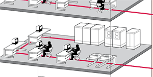
Detail from a network diagram for a book by ICL.
This was an early piece of commissioned work which grew out of my acquaintance with the technical authors group based in the Manchester offices of International Computers Limited, ICL (now subsumed into Fujitsu UK Ltd).
They were writing a book about their advanced mainframe operating system, VME, the Virtual Machine Environment, and wanted to have the book extensively illustrated with diagrams. Initially I was involved in the project by advising them on typographic choices. Once it was established that the book was going to be put together in Aldus PageMaker and the platemaking films would be output from a PostScript imagesetter, it was clear that the diagrams would be best produced as Encapsulated PostScript (EPS) files and imported into PageMaker.
The book’s accent colour had been defined as a particular shade of red — Pantone 200, I think — so I designed the fifty or so diagrams to take advantage of that. It is easy in Illustrator to designate objects as being in a spot colour, and to say whether lines and fills should overprint those below them, or ‘knock out’.
Many diagrams — such as this one indicating a Local Area Network — were composed of modular symbolic elements, which made it easy to build a symbol library and re-use the components, speeding the work.
Vietnamese mother (1987 and 1990)
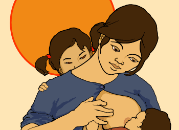
Detail from Illustrator art of Vietnamese mother.
This was another ‘artistic’ project without any commercial purpose, undertaken to see if I could adapt the variable- thickness line technique of my brush and ink work to this electronic medium.
The original was copied from a photograph I had taken in Sweden in the early 1980s while accompanying the veteran peace campaigner Peggy Duff on a visit. The original painting, by a Vietnamese artist, is owned by Swedish politician Anita Gradin.
The essential technical feature of this artwork is that although it appears to be line and fill work, there are in fact no lines at all — or to be more precise, all of the paths are defined as displaying with zero width. You can imagine the image as being made up of stacks of shapes; the black outlines are the result of the coloured shape in front being drawn slightly smaller than the black object behind. Thus it was quite easy to vary the ‘apparent’ line weight and get the effect I was looking for.
I created the image initially as greyscale, but once Illustrator had matured into a full colour product and could produce colour print separations for cyan, magenta, yellow and black, I revisited the project, colourised it, had CMYK separation film positives run off on a Linotronic imagesetter, and had a demonstration Cromalin colour proof made from them.
Click here to see nearly the whole image in a pop-up window.
Click here for a zoomed-in view of the face, which not only shows the variable thickness line effect well but also has been modified to show how the eye is made up as a stack of superimposed elements.
Manchester Host training manual, 1990

Detail from a diagram in the training manual for the Manchester Host GeoNet system.
Towards the end of the 1980s, when I was still living in Manchester, I became involved with a project supported by Manchester City Council and Manchester Polytechnic to bring ‘telematics’ to the city. This was before the Internet had expanded beyond UK universities.
The workers’ co-operative Soft Solution was engaged to set up a system, and they did so by setting up the ‘Manchester Host’ with a stack of modems and a DEC MicroVAX minicomputer. I became a subscriber, and I went on a free training course about how to use the system. But I was far from impressed by the quality of training materials and system user documentation.
A part of the problem was that the Host was implemented as a node in the global GeoNET system, developed in Germany, and remote users had to ‘drive’ it through a bare VT-100 text terminal interface, with a lot of commands to remember.
Manchester Poly (now Manchester Metropolitan University) had plans to roll out Host training across Europe, with a focus (partly due to the priorities of the funding source) on women’s groups. It was decided that an attractive and easy to follow training manual should be put together, the team being the Poly’s Sîan Basker as the major instructional writer, while I wrote some technical chapters, created illustrations and diagrams, and put the whole document together in (newly acquired) Framemaker 2.1 document composition software.
The introductory chapter was particularly heavily illustrated, describing and diagramming a scenario whereby ‘Kusem’ in Manchester wants to work electronically with ‘Elena’ in Melbourne, which is a real challenge if they both have to be online at the same time via a direct modem link over the telephone system. How much more convenient to use the ‘store and forward’ messaging facilities of local GeoNet hosts, linked together via a dedicated data line!
From an artwork design and production point of view, note that these diagrams use many of the ‘modular object grouping’ features of Illustrator as in the VME example above, but the character of ‘Kusem’ is given a more rounded appearance by using the ‘virtual variable thickness line’ technique I first used in the Vietnamese art example, also above.
Click here to see an enlarged version of this detail extract.
Click here to see a wider view of the upper half of the diagram, including the link to the Host’s MicroVAX minicomputer.